- Year
- 2021
- Client
- GreatCare
- Services
- Branding
- Websites
- Apps
- Motion & illustration
- Link
- greatcare.be
GreatCare
Brand identity
Of course, we did not started our collaboration with the logo and the website of GreatCare. Still, for the sake of clarity, it’s good to know that EPIC went far beyond just developing the web application. For nearly two years, we collaborate with GreatCare from the brand positioning to the visual identity, the web landing pages and stationaries.
Quite at the opposite of most of the actual healthcare platforms, GreatCare was looking for an identity that inspires trust, empathy, simplicity and authenticity… just like the way most patient would decribe his relationship with his/her lifelong personal doctor.
A better agenda
We could spend pages explaining how many UX Research workshops and prototyping sprints we’ve done with the GreatCare team to narrow down the list of the must-have features that would really make a difference for the healthcare specialists.
Let’s just say that, in the end, it always came down to the same priority: a frictionless and friendly end-user interface and an efficient agenda for the caregivers.
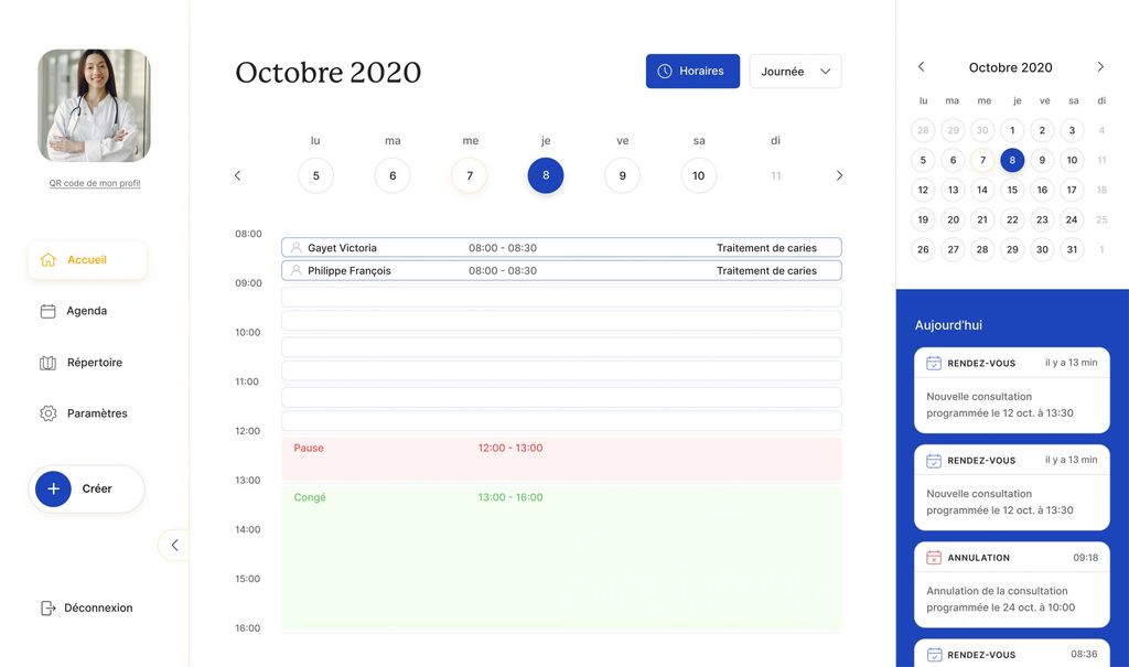
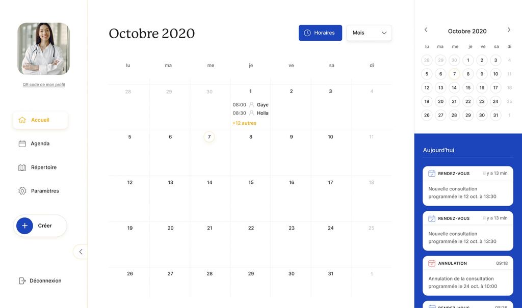
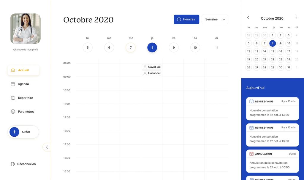
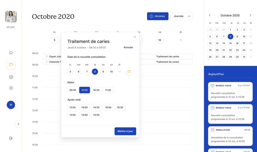
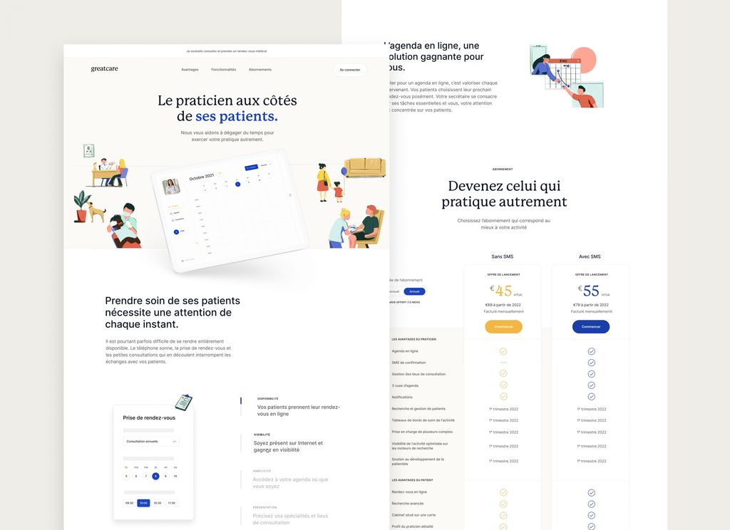
The first and most prominent tool of the platform is full-feature agenda to help manage the appointments.
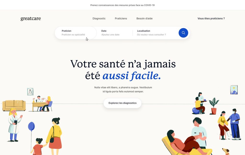
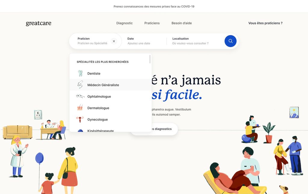
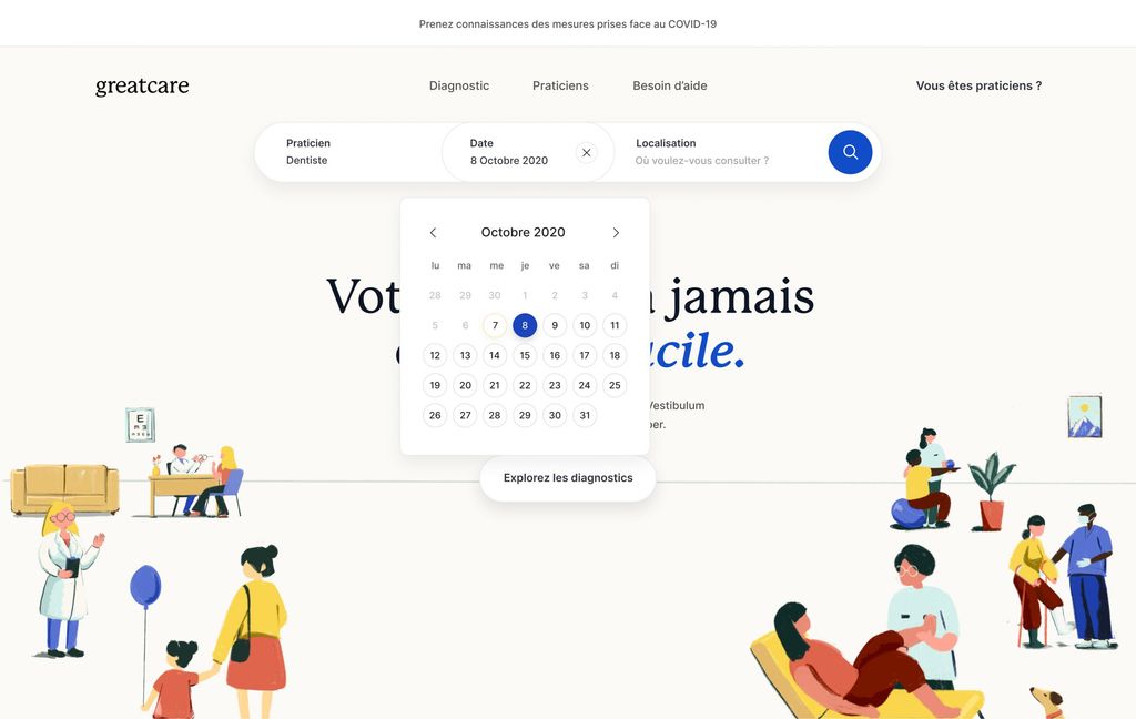
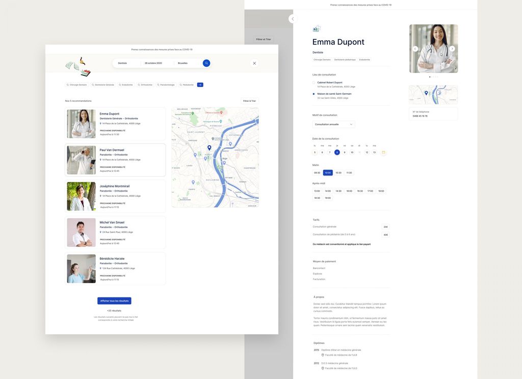
A frictionless search
For the end user, whether it be our grandmother or your nephew, what matter the most on such platform is to be able to find a healthcare specialist seamlessly, with accurate information and trustworthy information about his/her speciality and have a clear view of his/her availabilities.
More than a phone number
What could be more frustrating when you’re searching for a particular healthcare specialist than just finding a cold phone number on the Internet with no additional details? Of course, it would not be realistic (nor recommended to be frank) to ask your doctor to be on TikTok but still…
What could be done to make such crucial step less stressful? That’s how we approach the design of that feature: trying to put the user at ease with a more human-centric profile.
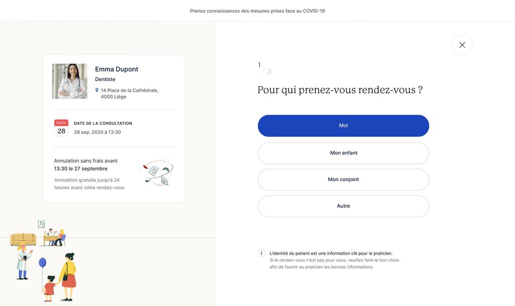
Appointment booking tool
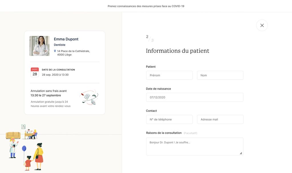
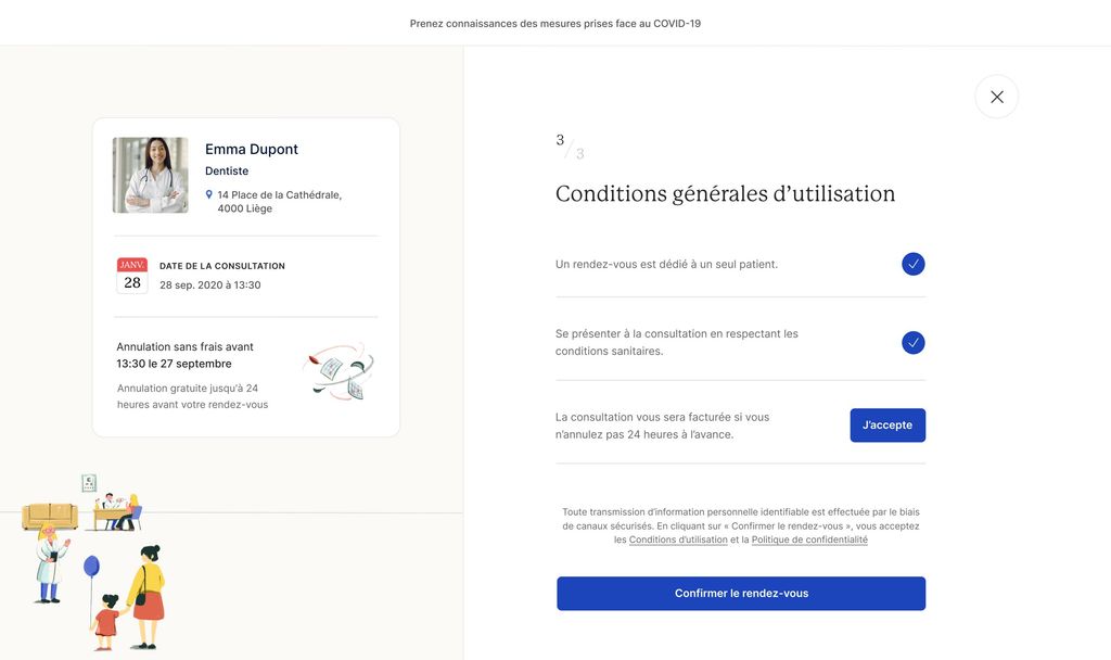
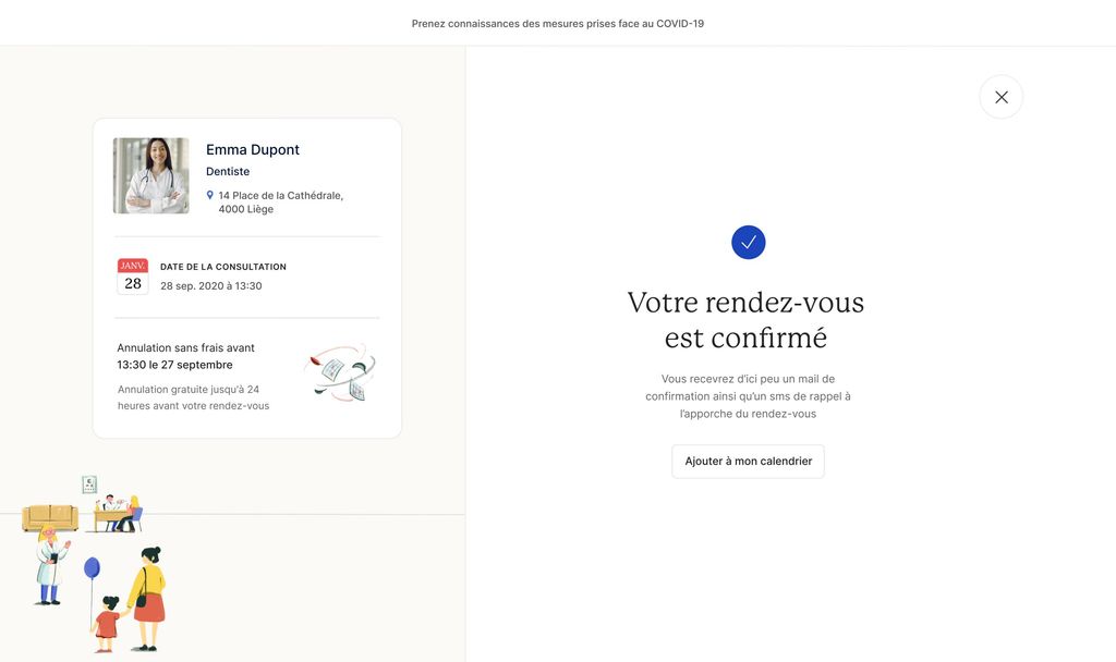
As we already said: the focus was to build a frictionless appointment tool. Just like modern booking platform, the patient should be able to book an appointment in just a few clicks, no matter if he’s in the bus or at home organising the family agenda.
But more than being able to book easily an appointment, being sure that you’ll receive the proper confirmation, reminders and heads-up in time to not forget it, is super important.
