- Year
- 2021
- Client
- Bemac
- Services
- Branding
- Websites
- Photography
- Link
- bemac.be
Bemac
Branding facelift
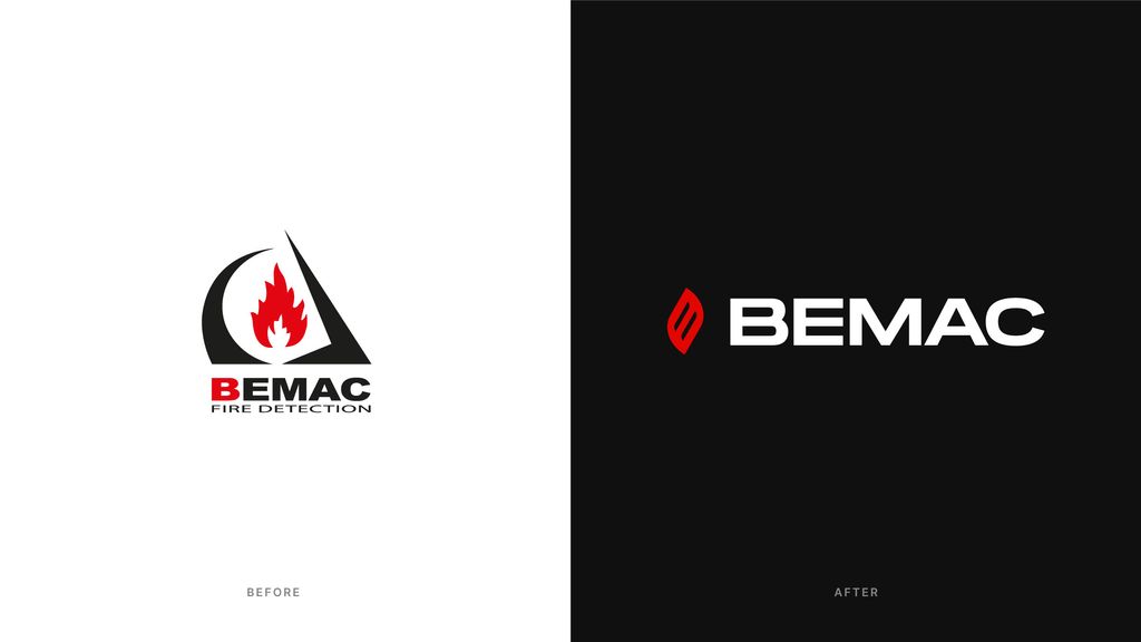
Let’s put it this way: Bemac has been around since nearly 50 years… Which means that, even though they are considered as a leader in their field of activity, their brand image was not up to today’s standards anymore.
It was definitely the right time to refresh it.
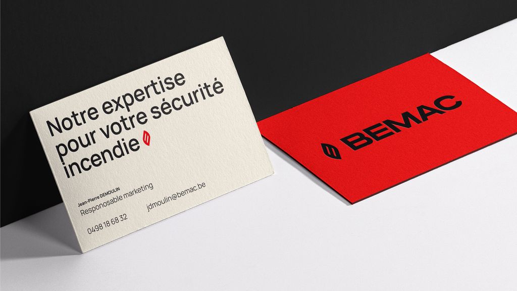
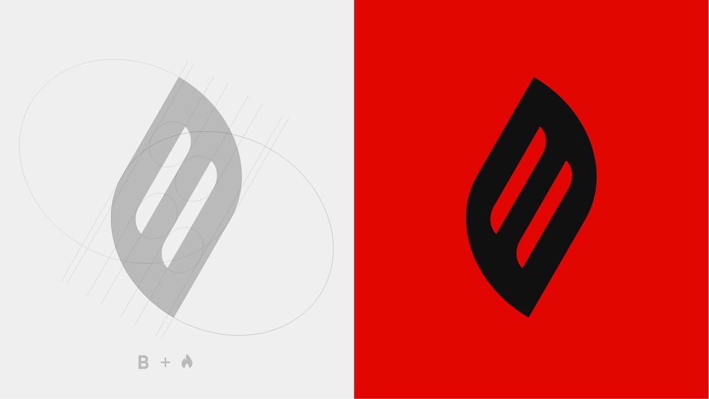
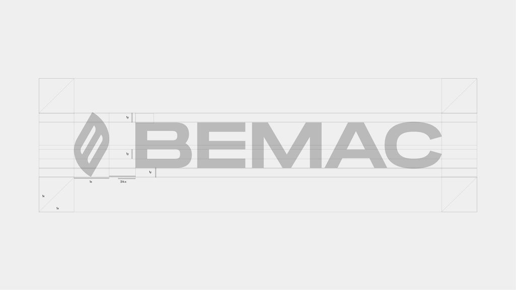
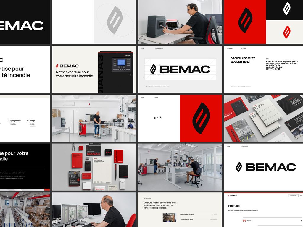
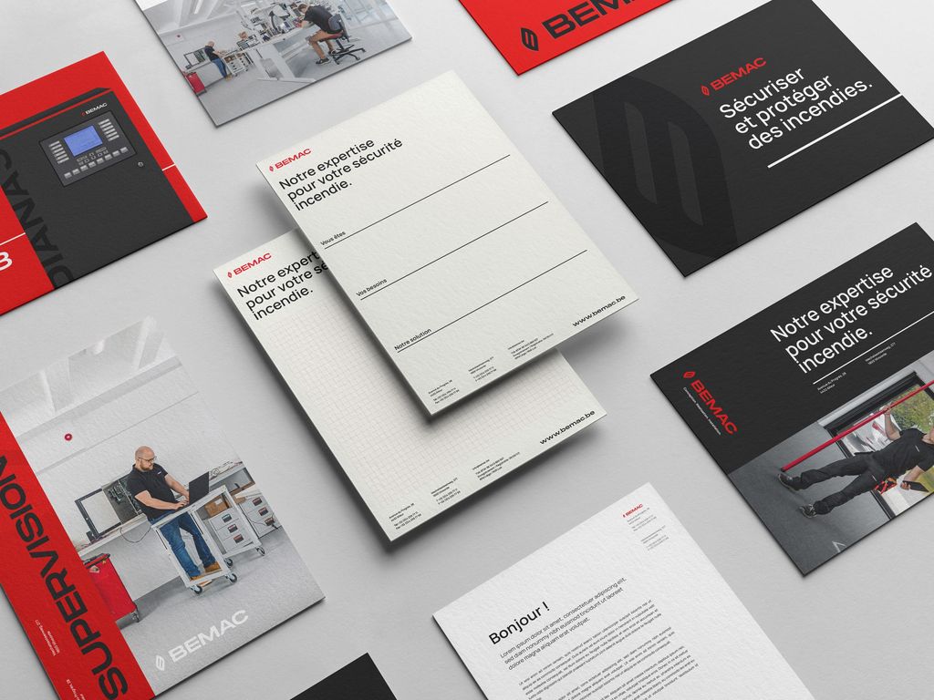
We went down to the very core of what the company is, what they do and their business values to completely revamp their visual identity while keeping the strong elements that made them distinctive among their customers and prospects: their corporate black & red colors and a flame symbol.
Modern website
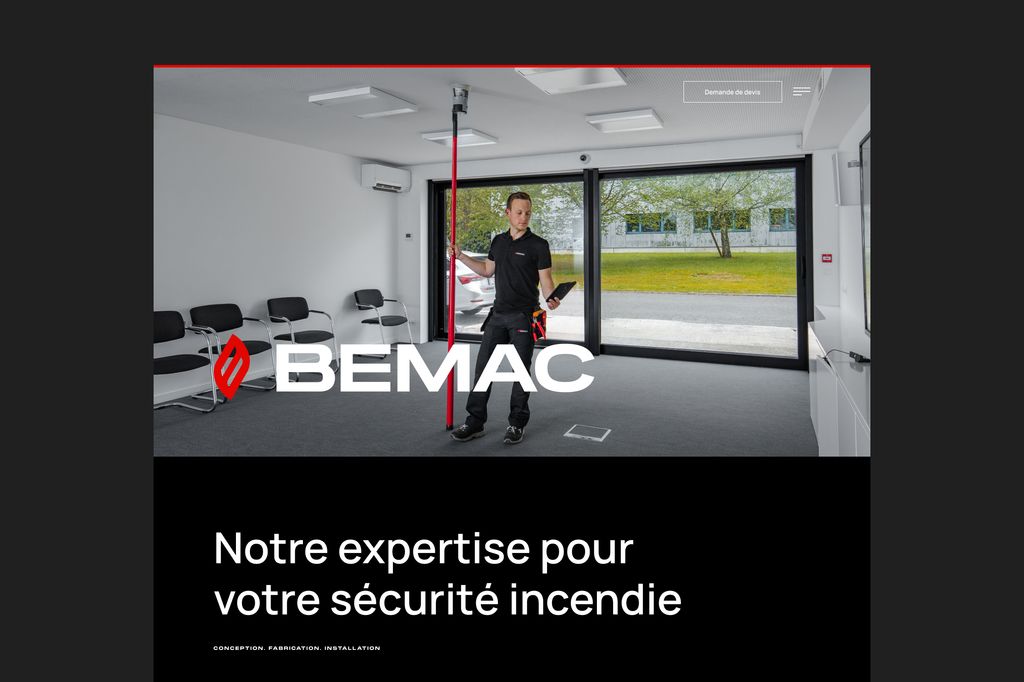
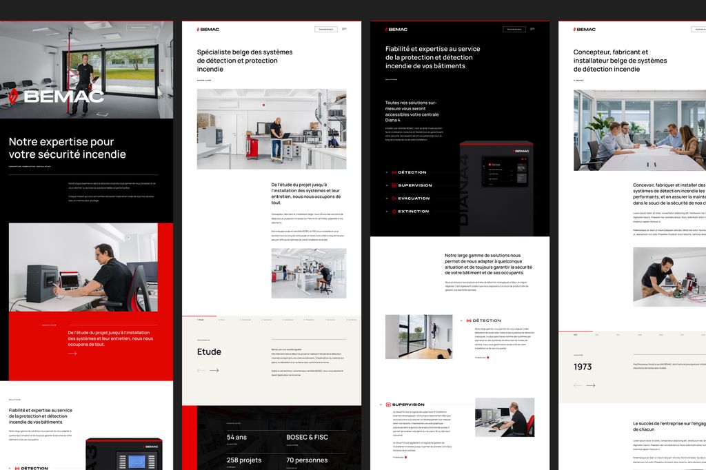
As for their historical branding, Bemac’s previous website was not in line with the quality of services and professionalism they provide to their customers.
To upgrade their digital presence, we did not only update the website’s design, we reviewed the whole customer digital journey step by step: personas definition, customer journeys, feature requirements, micro/macro conversions, UX research, wireframing, design, development and testing. All that on a custom-crafted WordPress installation to give them full autonomy on updating the contents.
Some of their oldest employees might still regret the old website and logo but…. yeah no, no one ever wants to see them again to be honest (They said so, so it’s ok for us to say it too, right?).
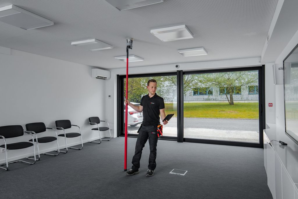
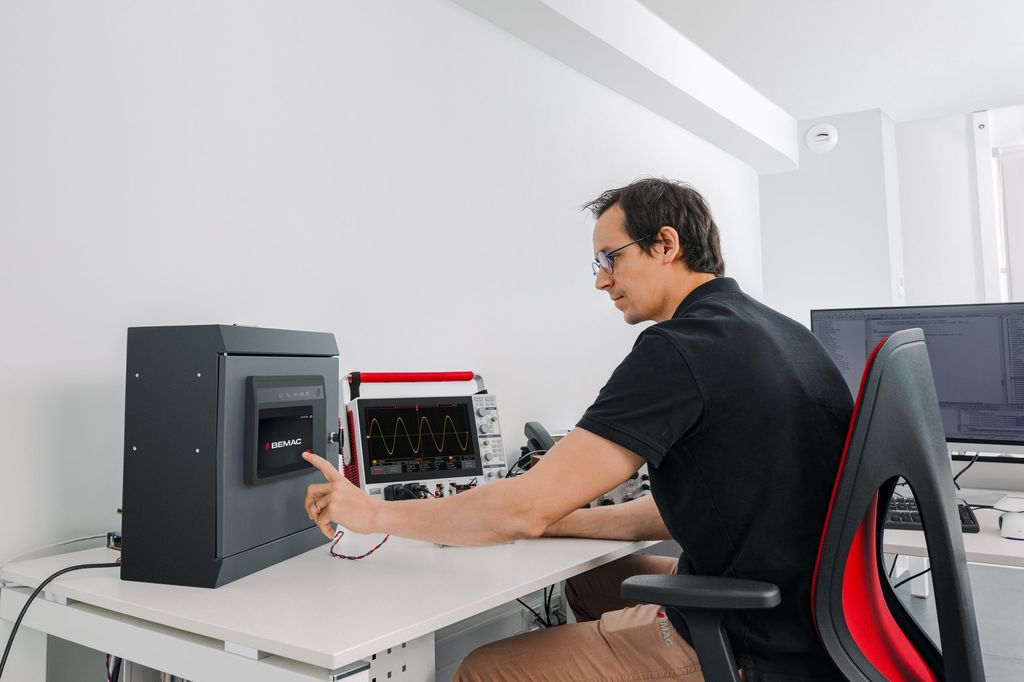
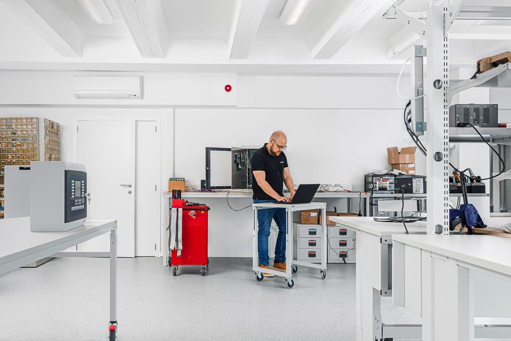
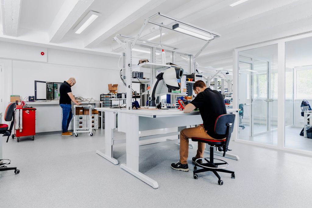
Photoshooting vs photostock
New branding, new website but old pictures from 2002? Not on our watch!
We’ll always be advocates of a real life photo-shooting over stock images, however qualitative they might be! Better for the brand image, better for the client’s wallet (unless they were thinking about having the same used-up you-know-who-stock-photos like just any other player on their market), and better for their employer’s branding!
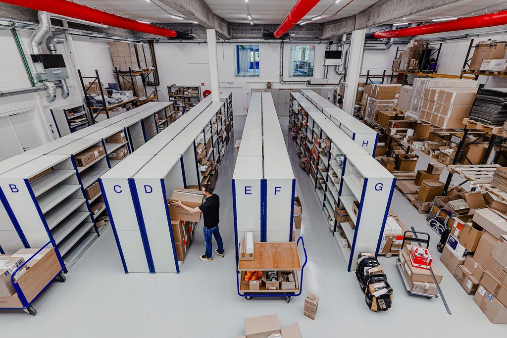
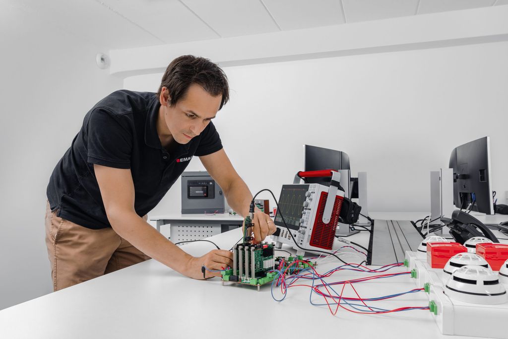
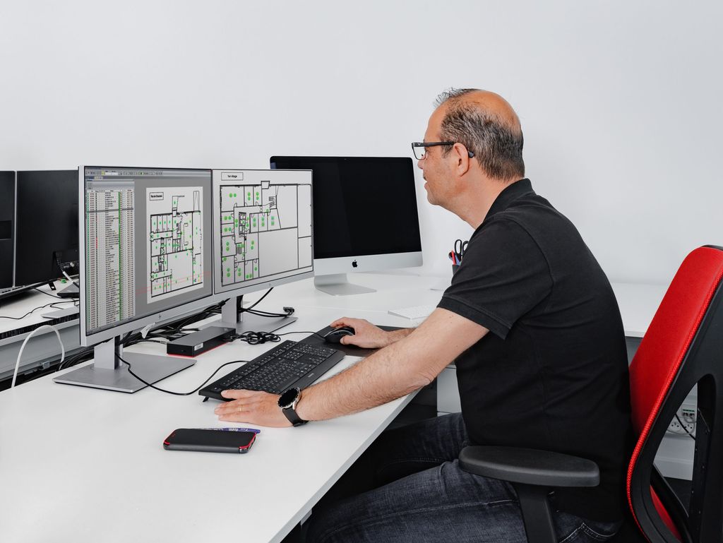
We sent our beloved photograph to Bemac’s offices to snap loads of on-the-spot photos and use them to refine the overall look of their brand new tools yet a bit more!
Interface design
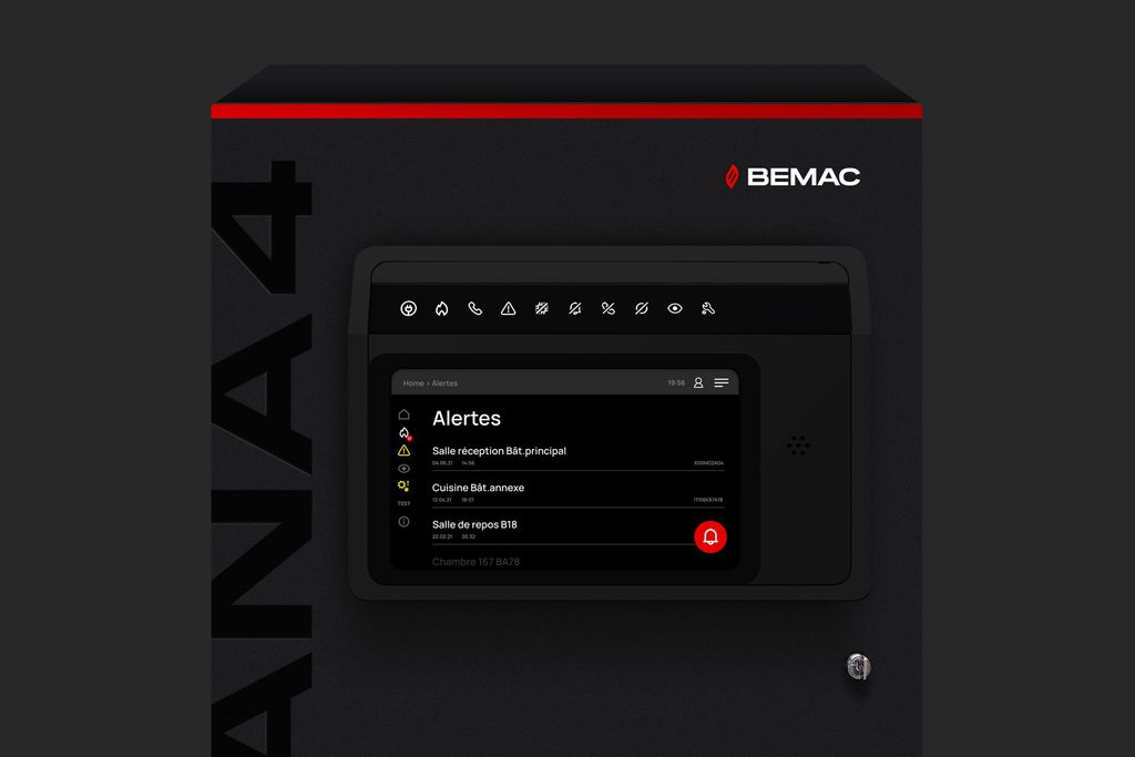
As the new branding and website were coming to life, we also got the opportunity to do something new: updating the UX/UI of their new fire detection system’s display unit!
While its usage is completely different than the website, the control display unit is a key touchpoint in Bemac’s customer experience as their client interact with it nearly every day.
- Visits+30%+30%
- Bounce rate-11%-11%
- Avg. time on page+51%+51%
