- Year
- 2018
- Client
- Zinacor
- Services
- Branding
- Websites
- Photography
- Link
- zinacor.com
Zinacor
Pure B2B players looking their best
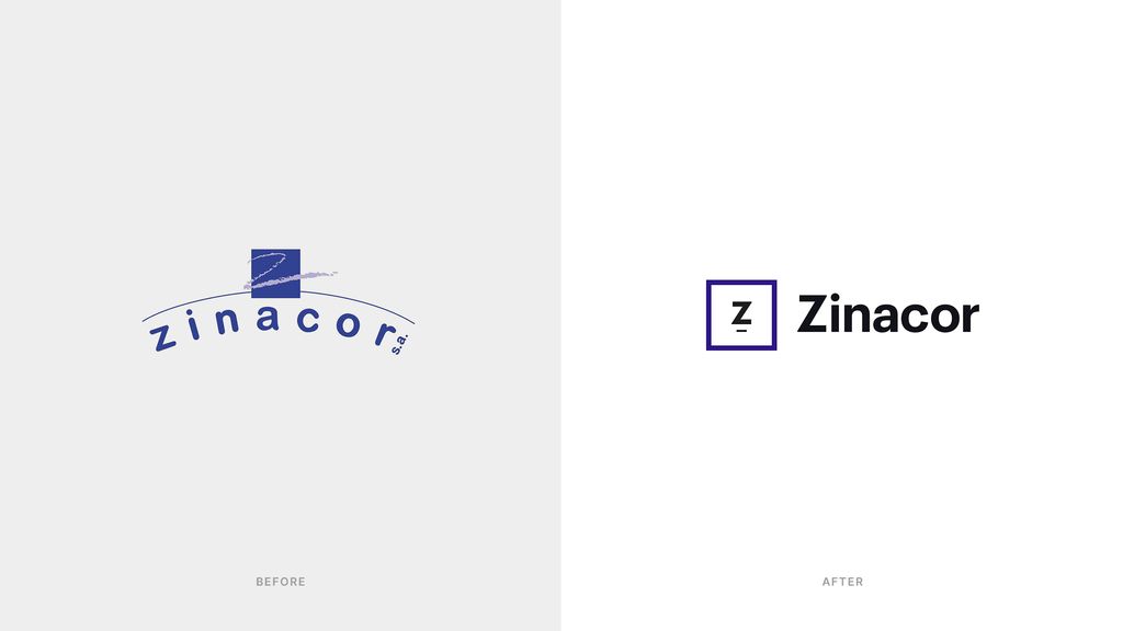
In 2019, Zinacor clearly identified one of their main pain points in terms of communication: they offered better product and services that their competition but were losing market shares to newcomers with inferior products but stronger brand identity and modern-looking digital tools.
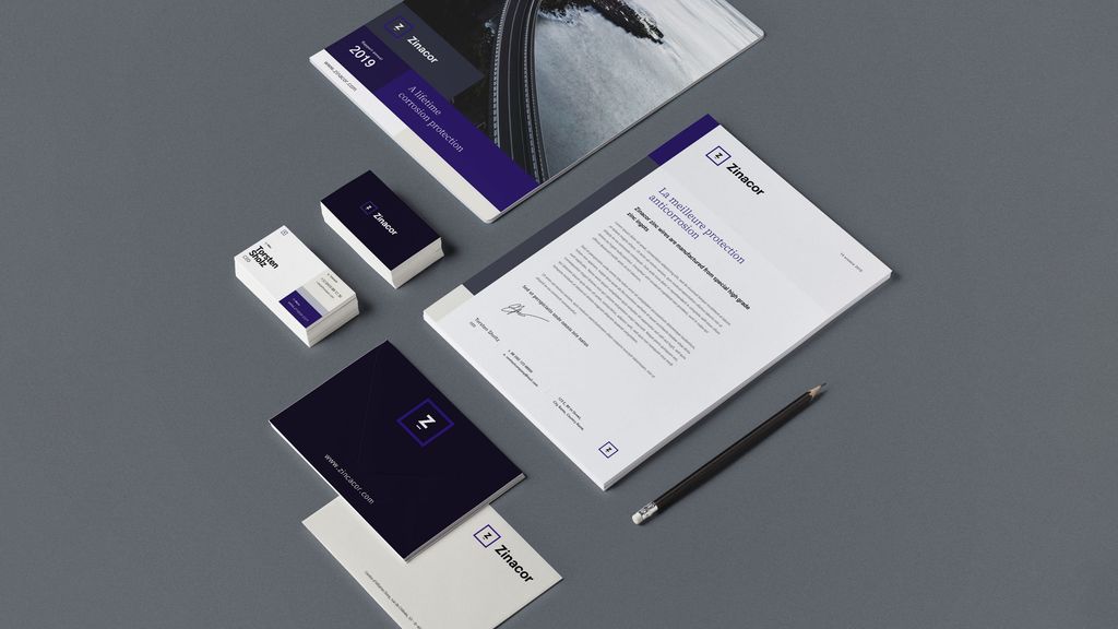
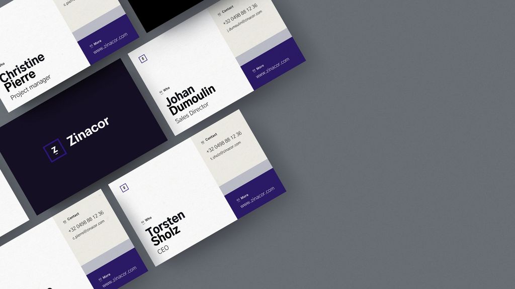
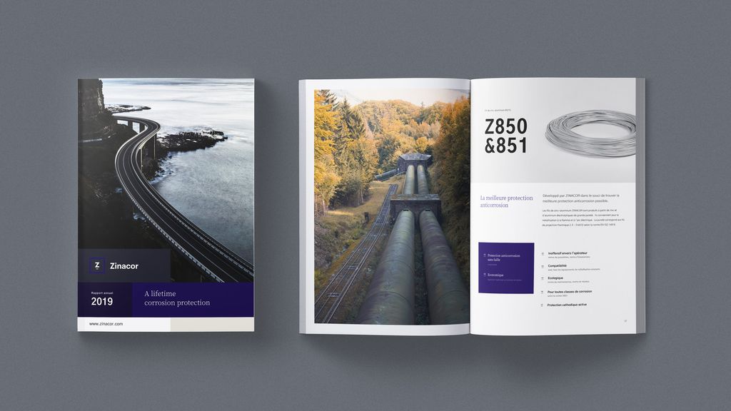
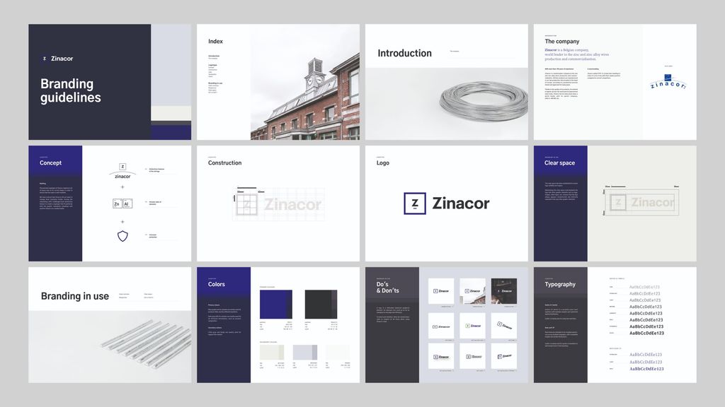
The goal was clear: stepping Zinacor’s game up and bring them up to speed in terms of digital communication. It all started with a request to refresh their website and it ended with a complete overhaul of their visual identity and materials.
Website
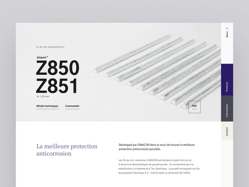
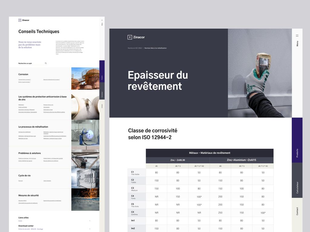
The website was really cool challenge. Because of the nature of their market, their catalog is full of technical specifications that requires a strong expertise to use it and find its way through all the products.
Plus, from a visual standpoint, it’s quite hard to see the difference between them.
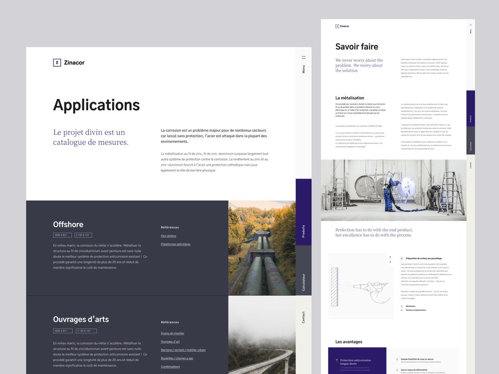
We spent a lot of time doing UX research and iteration with their marketing and sales team. Our goal was to find the best way to offer several intuitive ways to find the product you’re looking for. In addition, we also wanted to use the website to deploy the new brand identity.
The result is a mix a smooth animation, bold text and colours packed with a unique navigation system.
Photos & Vidéos
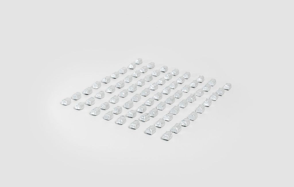
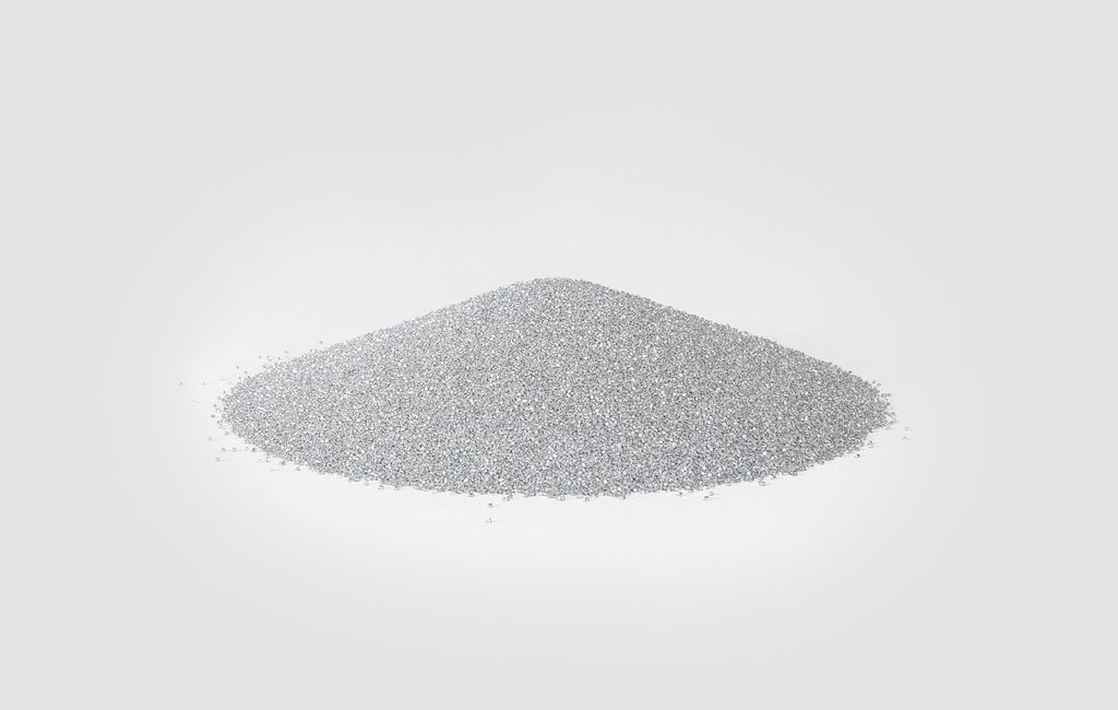
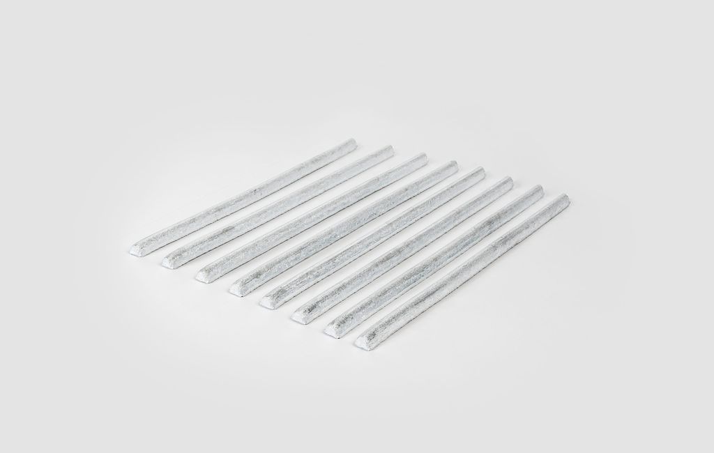
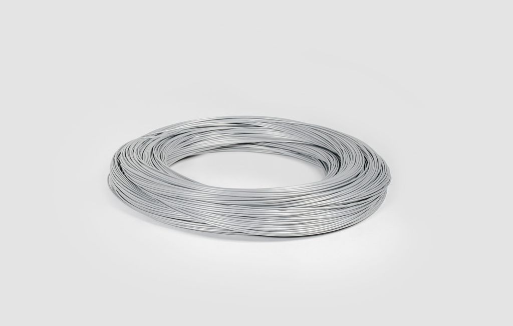
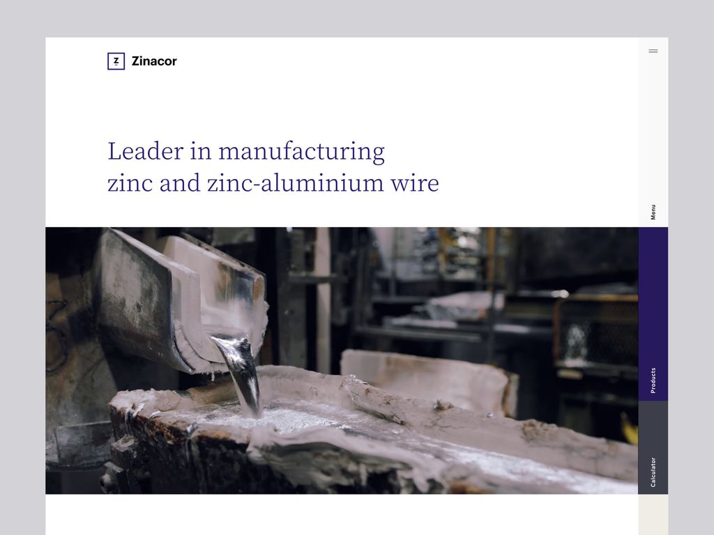
Because their work is not very visually appealing nor tangible (we’re talking about zinc wires…), it became rapidly clear that having consistent and creative visual assets would be critical to convey the values and core components of their new brand identity.
After defining an art direction, our design team went to Zinacor’s main plant to capture products packshot, video loop and photos.
- AwwwardsSOTDSOTD
- UPMC 2020Best DigitalBest Digital
