- Year
- 2020
- Client
- UPS
- Services
- Games
- Experiences
- Link
- ups.com
UPS -
Delivery day
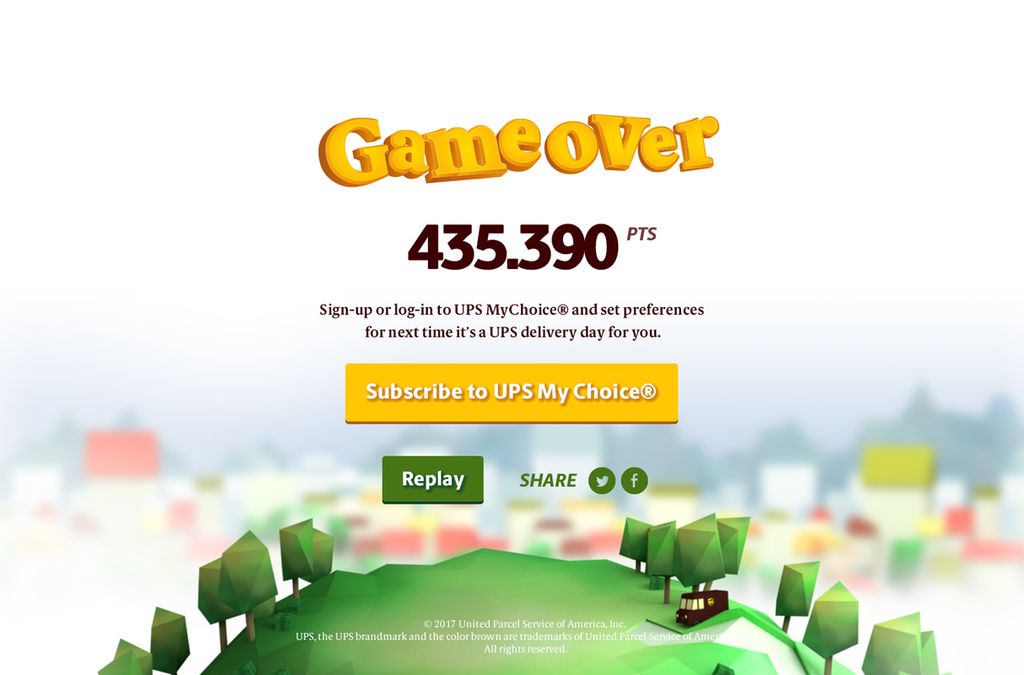
UPS asked us to come up with a creative concept to raise awareness around their UPS MyChoice® service and UPS Access Point®.
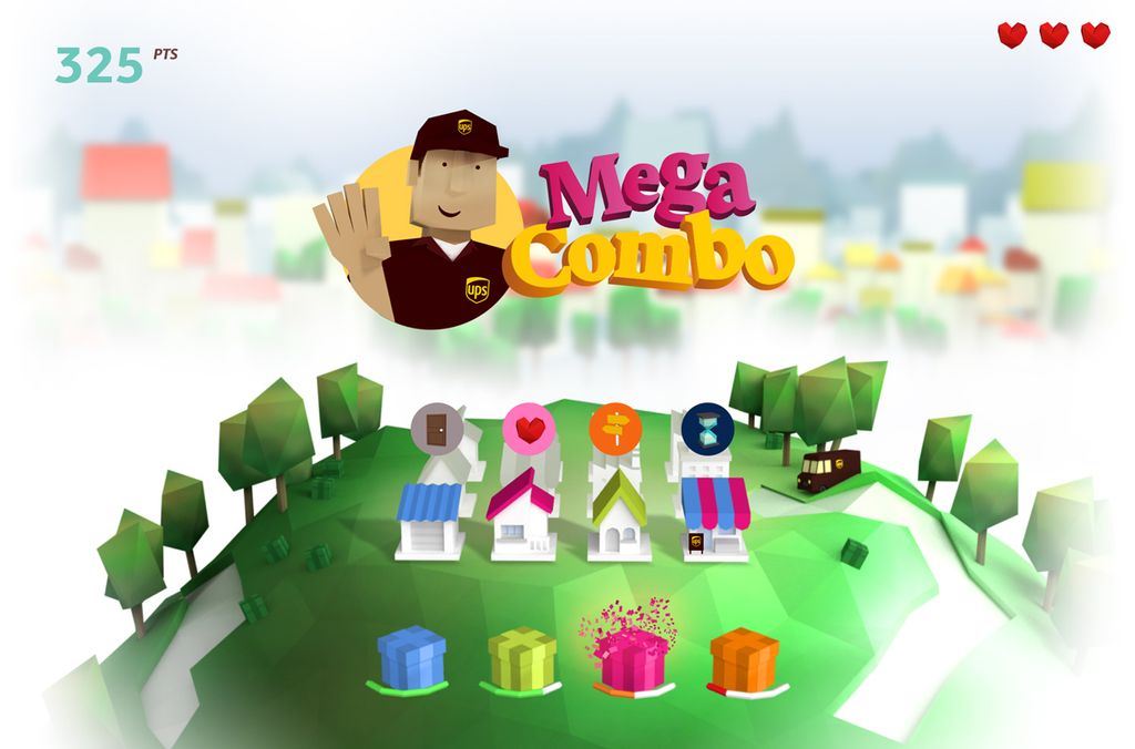
Rather than yet another landing page on their corporate website, we pitched them a mini-game where the player has to sort and send as many parcels as possible before the clock runs out.
Be fast, precise & smart
This is what it takes to be a real and reliable UPS Driver! This game is all about organizing your parcels as efficiently as possible to make them match their rightful destination…don’t mix things up!
Some UPS Access Points will occasionally appear to help you deliver faster, don’t miss them out!
Mobile first, desktop friendly
No surprises here. Nowadays people navigate, shop and find their soulmate using their mobile phone. There is no reason they wouldn’t play games the same way. UPS Delivery Day was developed with mobile behaviors in mind from the start to make sure the gaming experience was optimal on mobile devices. Only then did we extend the experience to desktops so that everyone could enjoy the game, even on larger screens.
Minimum poly count, maximum heart rate!
We had a very addictive gameplay concept in mind which included a rich visual environment with real 3D assets. The things is that if you get too crazy with heavy assets, the performance of the game will tend to be disappointing on cheaper or older devices.
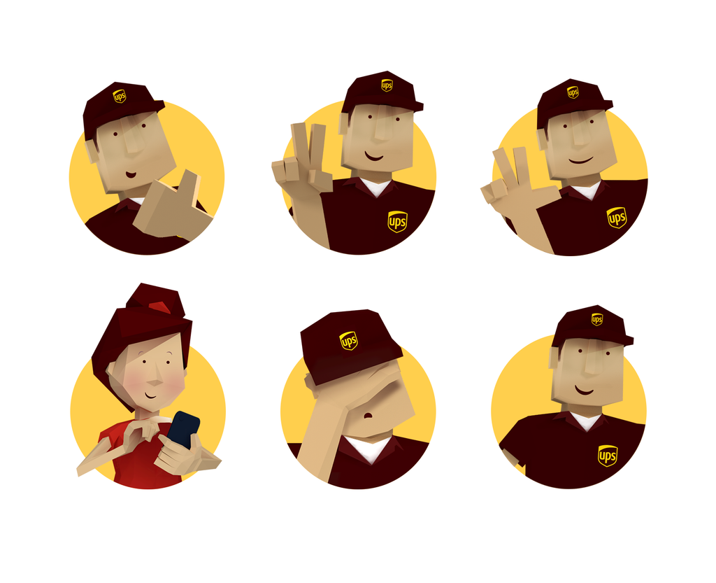
To ensure the experience was smooth and fully enjoyable on every targeted devices, we kept the polygon count as low as possible. The overall artistic direction is based on a “low-poly” style for that specific reason. That’s why we designed a freshly shaved UPS Driver (less beard, less pixels) in a low poly style who was able to coach the players, cheer them up, and even make a facepalm if that’s all they deserved.
Everything is ugly at first...
…Even babies (come on, you know what we mean). But aesthetic is NOTHING if the game is boring.
We prototyped the gameplay at a veeeeery early stage of the development to validate our ideas and vision. The video below shows how we went from a rough-looking monkey eating cubes under the guidance of Mario, to a polished game for a corporate brand. The only constant throughout the process? The fun it conveys.
