- Year
- 2017 - ongoing
- Client
- Uliège
- Services
- Websites
- Link
- uliege.be
ULiège
Scientia Optimum
Let’s be frank; revamping the 12.000+ pages website of a 200-years old university, it does not sound like a walk in the park for a digital agency.
But it was also a unique opportunity to have a big impact on our direct digital environment, and that’s why we’re here so… we applied.
The result? Thanks to an incredibly efficient and collaborative team, It’s been one of the smoothest and efficient project we had the chance to work one.
We were responsible for the whole UX/UI development while the backend (CMS) was handled by the IT department of the University (SEGI)
Designing for massive content
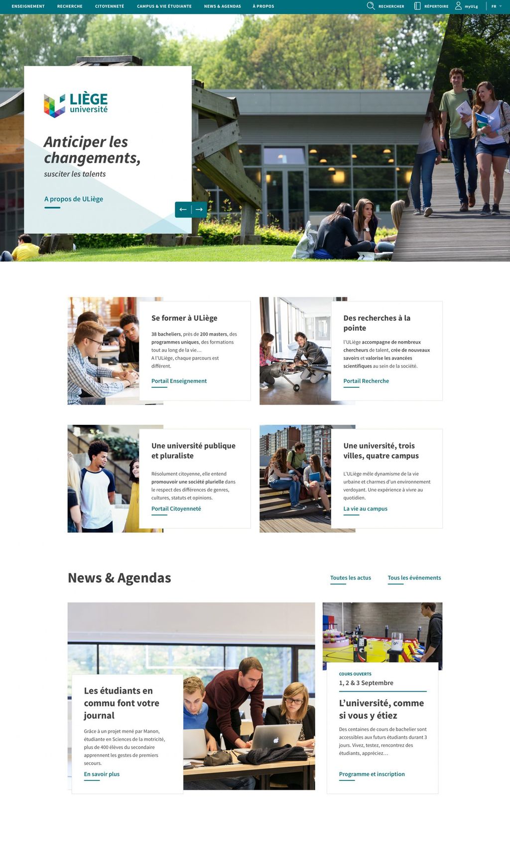
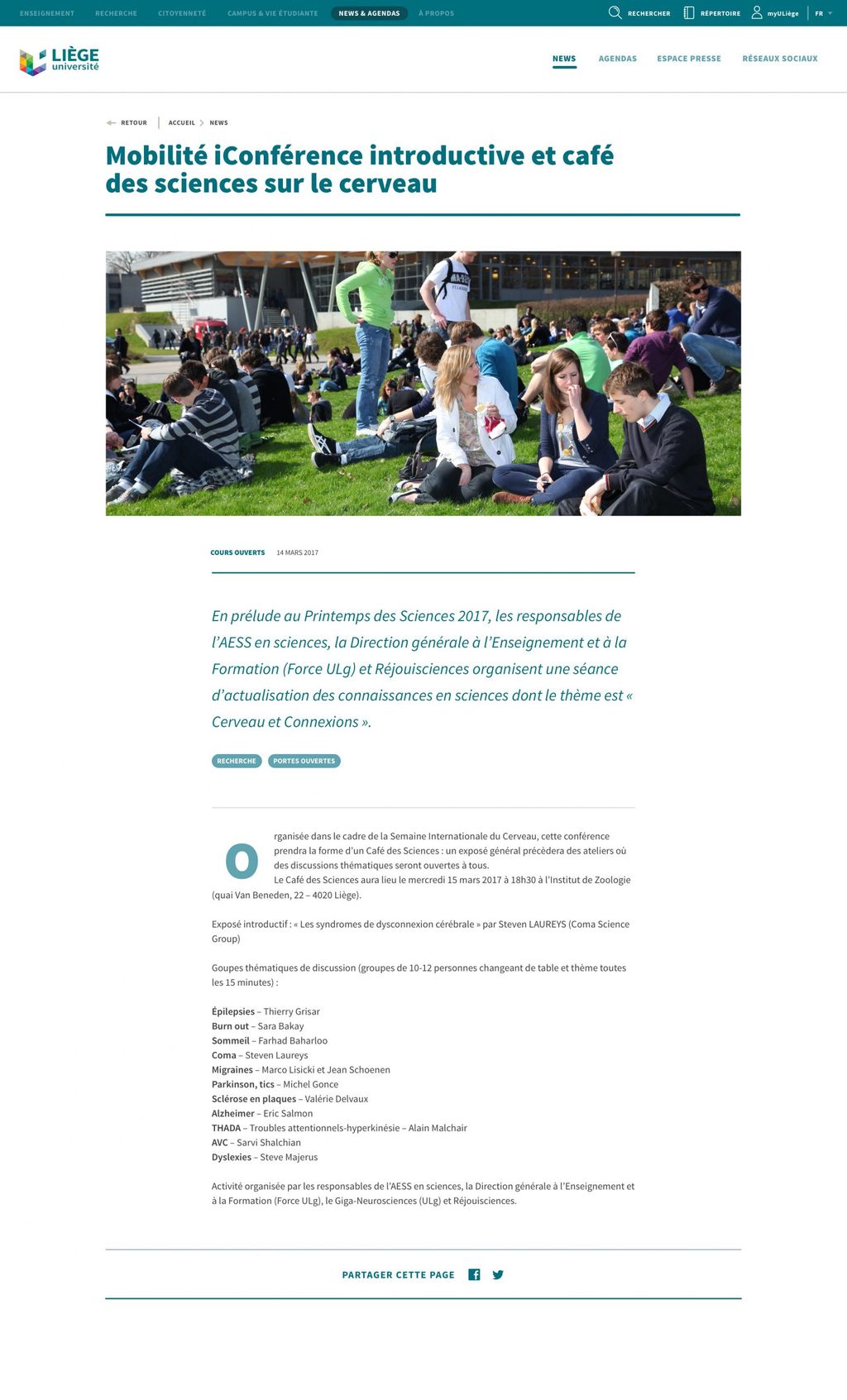
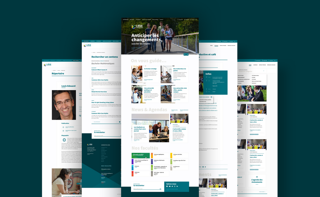
We’re not kidding when we say the website counts more than 12.000 pages spread across 11 faculties and even more departments and editors. Incorporating and integrating the wide spectrum of portals, intranets and pages into a user-friendly experience was a serious challenge.
To overcome this, we spent a lot (like, really a lot) of time with the ULiège team to simplify/consolidate/clarify the content architecture and build a flexible and granular design system, centred on the user experience.
Looking at the actual state of the website, we can reasonably say that the final result reached these goals, along with the ability for the platform to evolve through time.
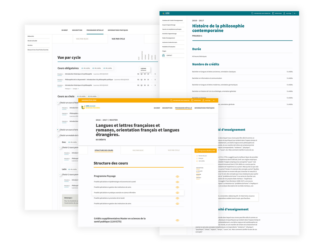
Complex navigation made easy
ULiège, as most of the universities in the world, has many stakeholders: students, alumni, local authorities, international partners,… It may seems obvious, but one tends to always underestimate how different they all are in terms of needs and usage on the university’s website.
This was another reason why we spent so much time reviewing the content architecture; making sure we’d have solid foundations to build a future-proof navigation system.
Designing for flexibility
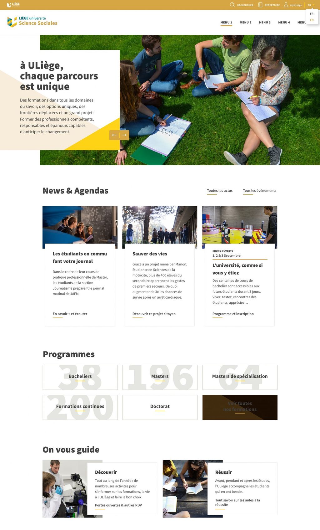
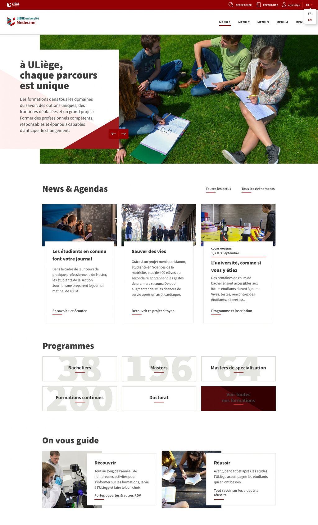
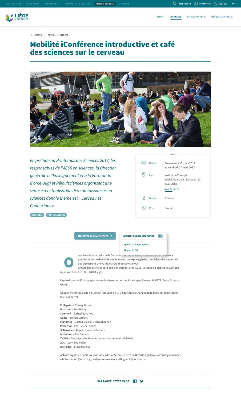
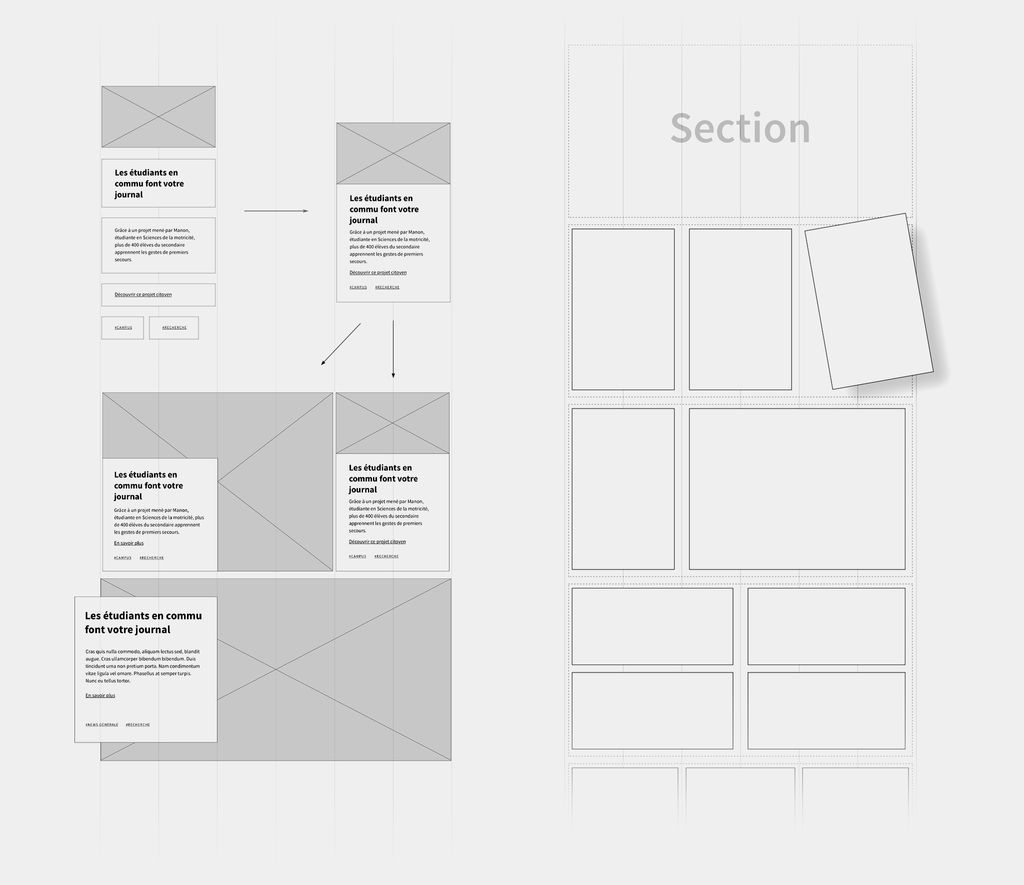
We believe that one of the key to generate user engagement is the ability to easily maintain content on a website. So, the best way to test our design system was to let users add and update content… With hundreds of editors (yes, hundreds!), we knew our work would be push to the limits.
Our challenge here was to ensure that the design would remain consistent throughout the years (ie: not allowing users to add custom text colours) without frustrating the editors with a too rigid system. To that end, we used an atomic design approach to build modular components that enable hundreds of visual compositions and give maximum flexibility to the users.
Massive community
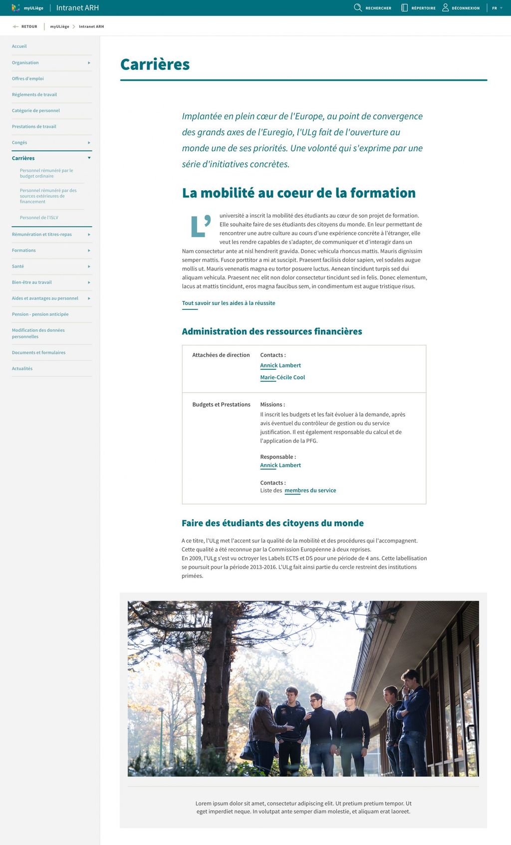
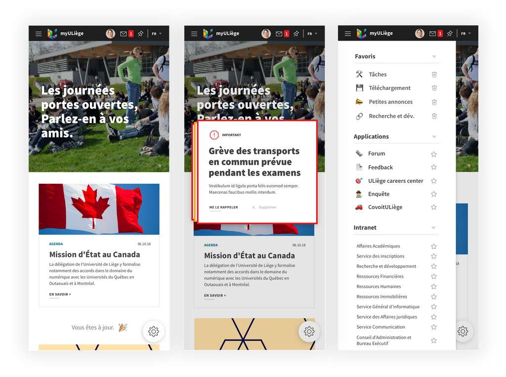
ULiège information’s architecture is not limited to their web portal. They have a lot of additional tools and platforms dedicated to their teachers, students, partners and staff members. The most prominent tool in that list is myULiège, one-stop-shop intranet for the University staff.
As this tool is tightly connected to the website, we also collaborated with the ULiège team to design the future of that platform.
- # Faculties1111
- # Pages12.00012.000
- # Editors200200
