- Year
- 2022
- Client
- ST'ART
- Services
- Branding
- Websites
- Link
- Start-Invest.be
ST’ART
Branding
ST’ART branding wasn’t all bad, to be honest. They had a visual identity that wasn’t from the 70’s and they already had some notoriety within the creative industry.
But competition being what it is among investment funds (it’s strong, in case you were wondering), we made it a point of doing things thoroughly to insure the end result would be a strong, meaningful and flexible brand identity.
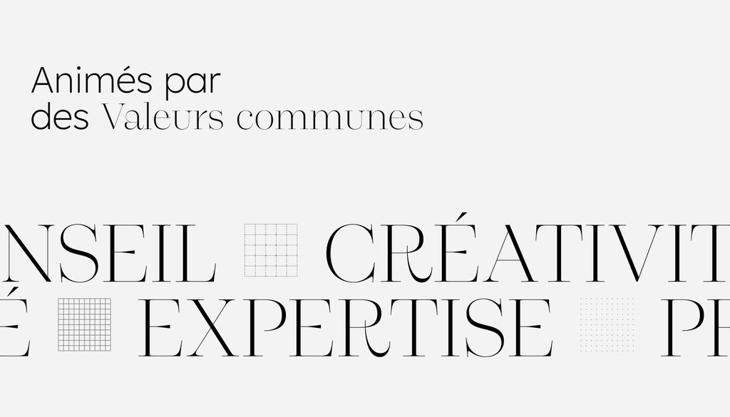
Several brand strategy workshop were setup to update and re-define ST’ART brand positioning for each of their personas & to define the very core of their brand: vision, missions and values.
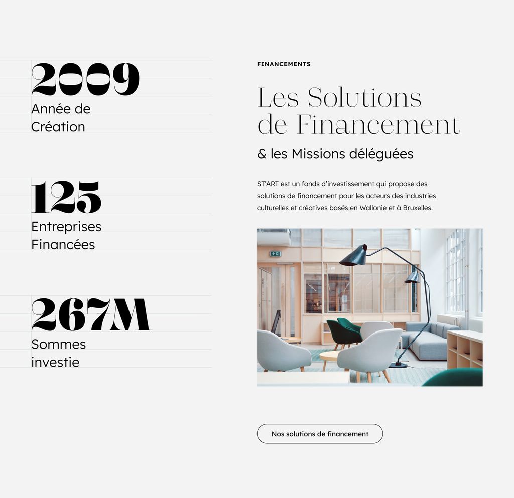
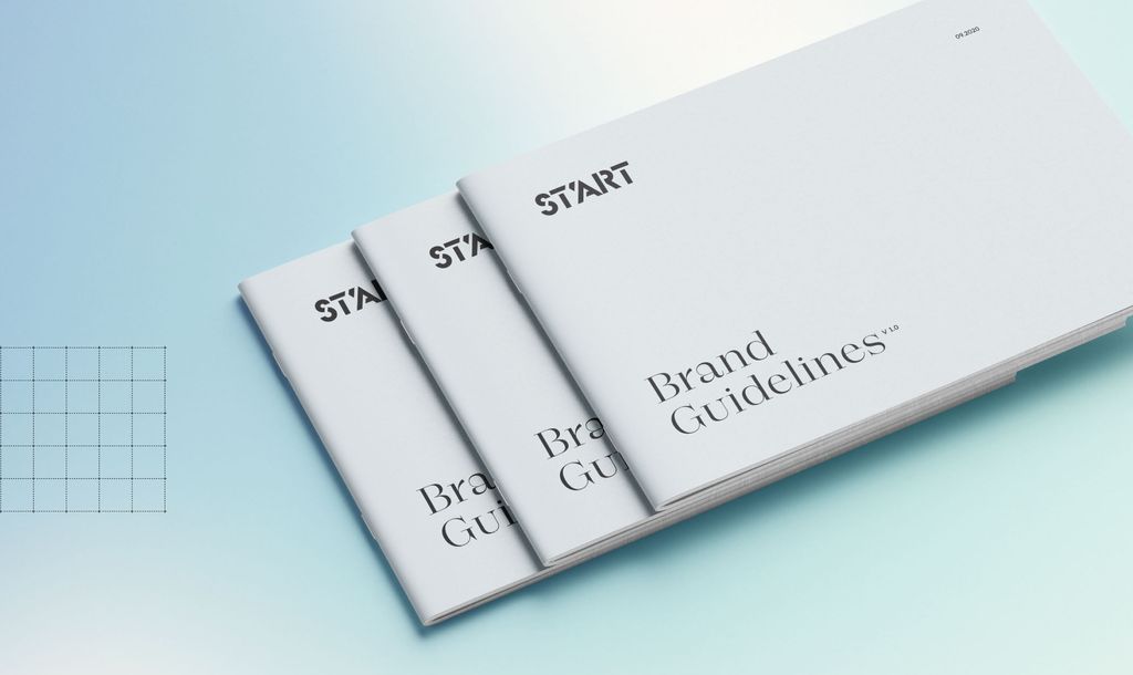
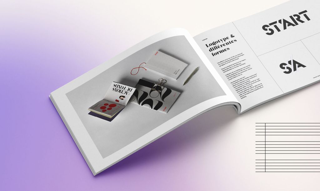
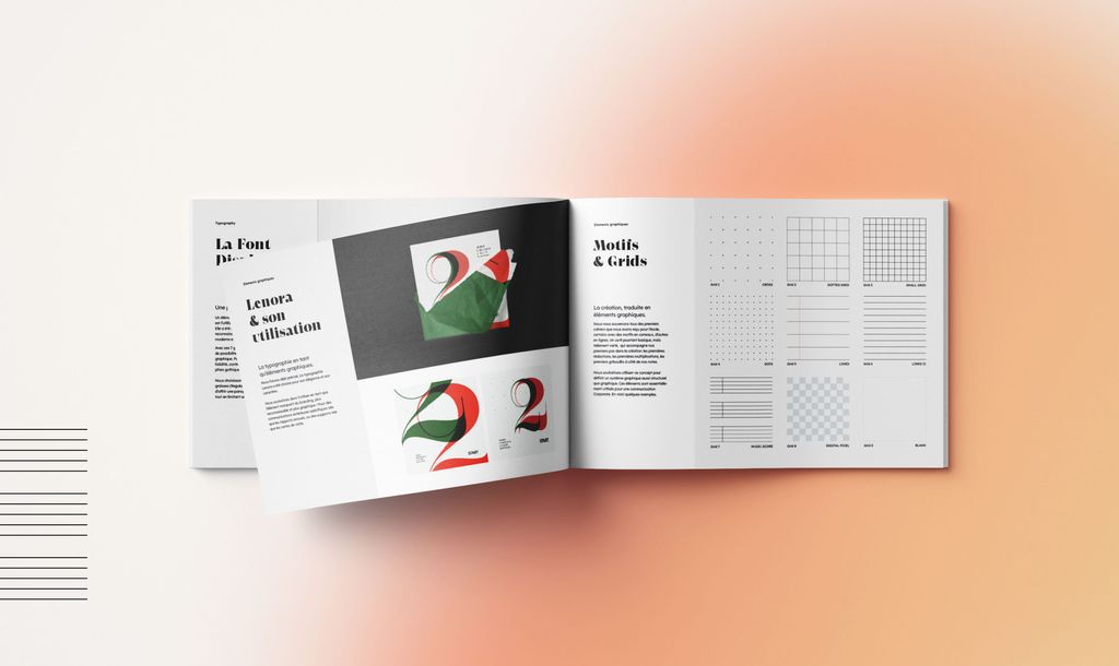
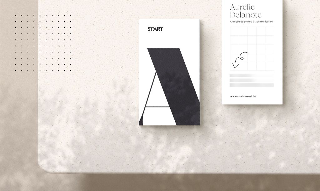
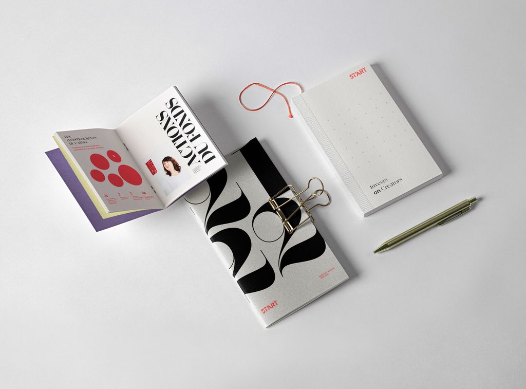
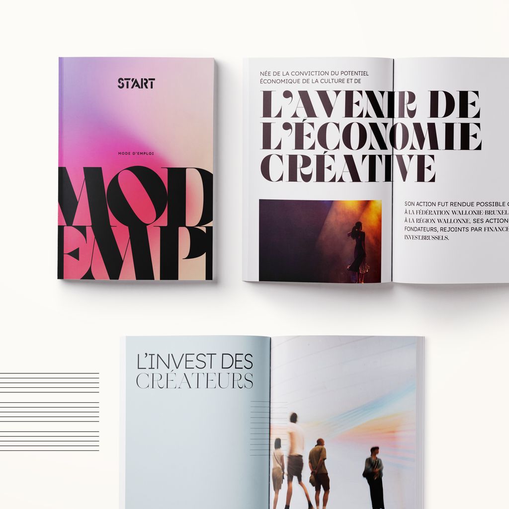
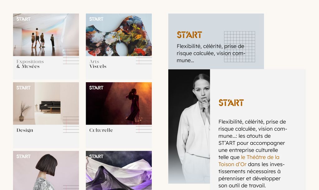
We completely rebuilt the visual identity based on all the brand identity workshops’ findings: logo, brand colors, typos and perspectives of deployment on a variety of communication tools: e-mail signature, business card, newsletter, social networks, event invitation, greeting card, flyers, activity report, website, etc.
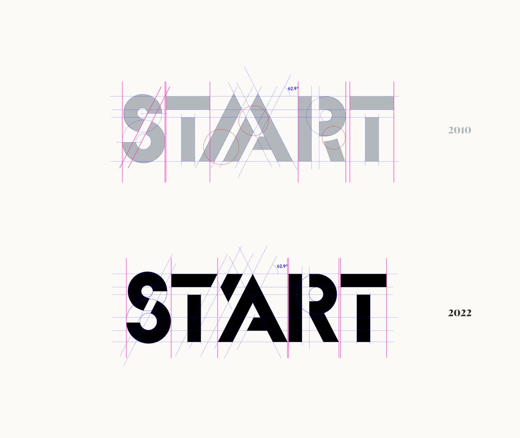
The logo already had some very cool design features that we wanted to keep and it was one of the factor of ST’ART’s acquired notoriety so we didn’t want to throw it all away. We still took it apart and rebuilt it for an up-to-date-more-modern-looking version of itself and to put it on track for the next 10 years.
Website
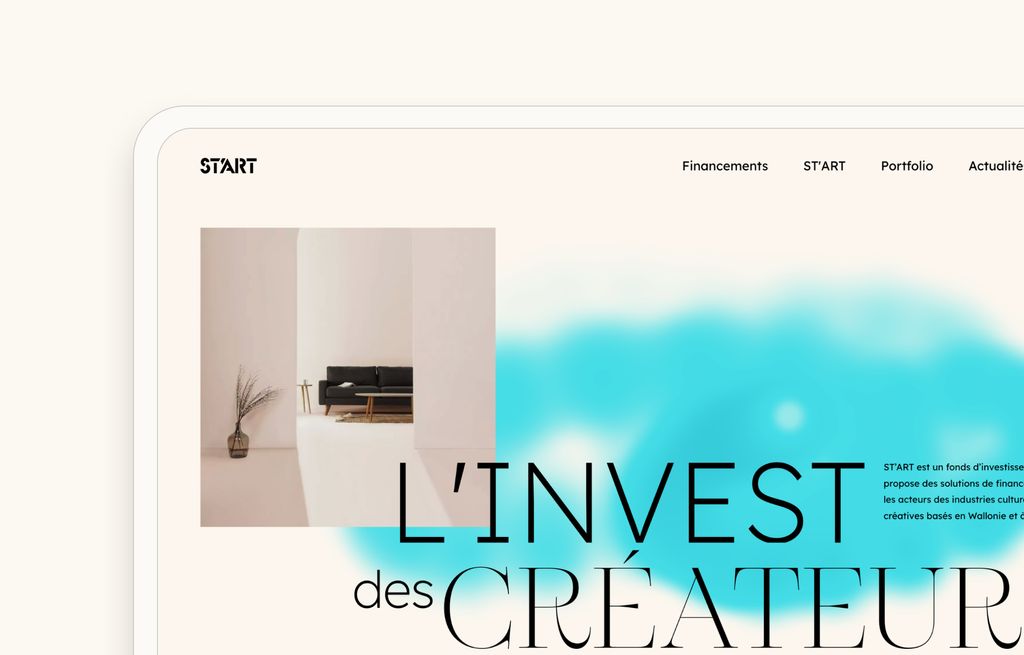
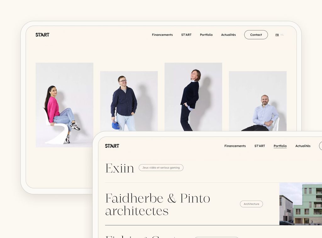
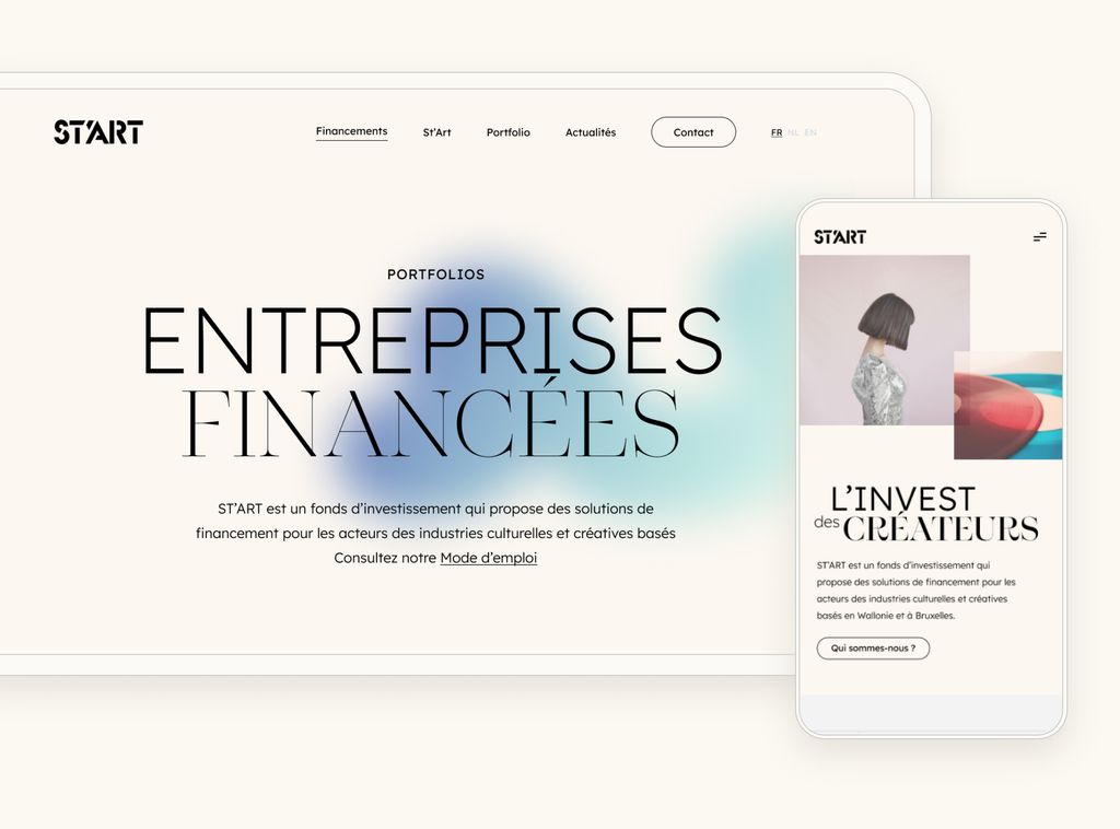
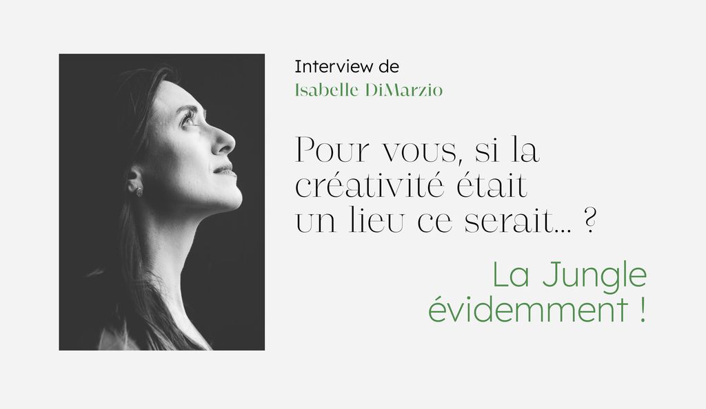
Once the brand identity was finalized, we rolled up our sleeves and got to work on the revamp of ST’ART’s website. Their previous website was no longer in line with the sectors that ST’ART represents: fashion, publishing, audiovisual, music, performing arts, design, cultural mediation, video games, exhibitions, museums, architecture, heritage, photography or visual arts.
The goal was clear: to turn their website into a real prospecting tool and to make their mission understood by a broad audience while showcasing their portfolio in a creative and attractive way.
The essence of the sector they evolve in (investment fund = serious, creative industries = creative) turned out to be a very interesting challenge to explore as it required a delicate balance between efficiency/rigor & creative surprises we love to throw in our project.
After 3 months of iterative design & development, we can proudly say we believe it’s a hit: a brand new web platform that give ST’ART full autonomy on the content updates while conveying a strong and innovative image of the company.
