- Year
- 2024
- Client
- Pairi Daiza
- Services
- Websites
- Link
- pairidaiza.eu
Pairi Daiza
Growth VS obsolete digital tools
Pairi Daiza has been growing and changing since it first opened, and there’s still more to come! The park is in the process of tripling its on-site accommodation offering, which will allow it to welcome considerably more visitors each day.
To make this happen, it was necessary to review the online ticketing system, which wasn’t keeping up with demand.
That’s where it all started for us!
As the discussions went on, it became obvious that building a modern ticketing system wouldn’t be enough.
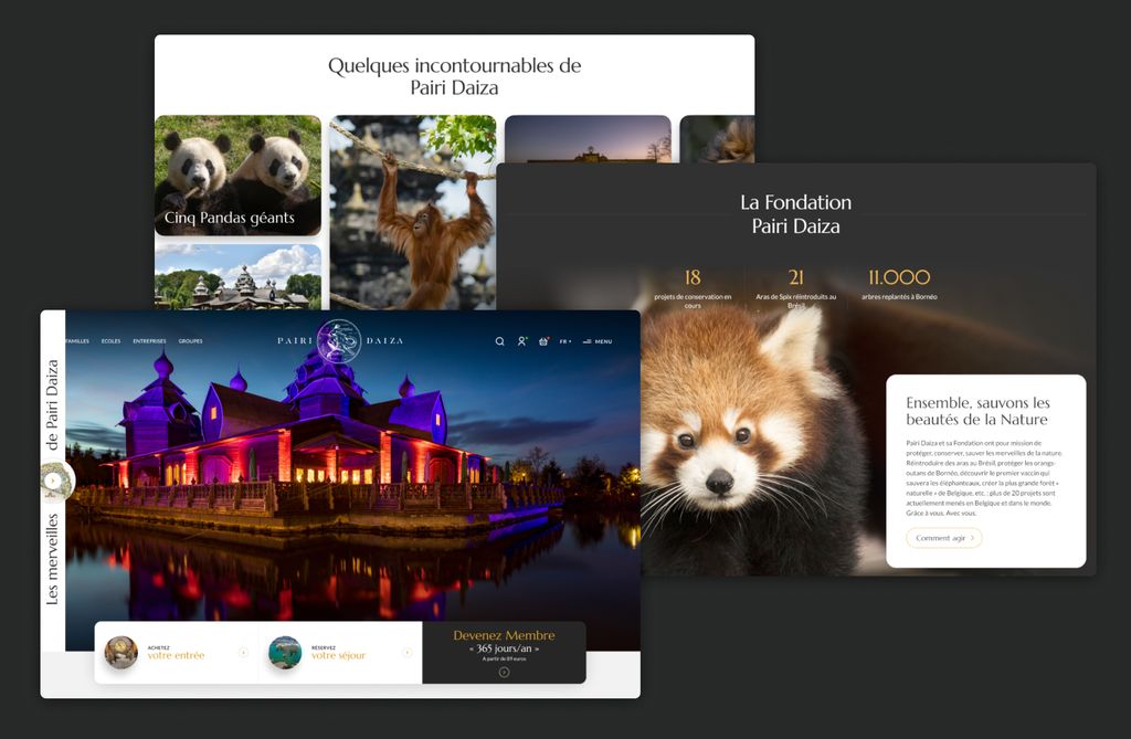
We had to completely rethink the user experience so that park visitors would get totally immersed in the world of Pairi Daiza, as soon as they entered the website.
Our mission
To help the park grow and give customers a qualitative experience from the moment they first interact with the park online, all the way through to booking their tickets.
As the website is Pairi Daiza’s main acquisition channel, we couldn’t take things lightly.
We had to create an interactive presentation of the park, come up with a new artistic direction, find ways to flexibly manage the content, figure out how to work with a complex technical ecosystem, and setup the tracking of a lot of different tools… It was a pretty big challenge, but it fit well with EPIC’s experience.
Modular design & autonomy
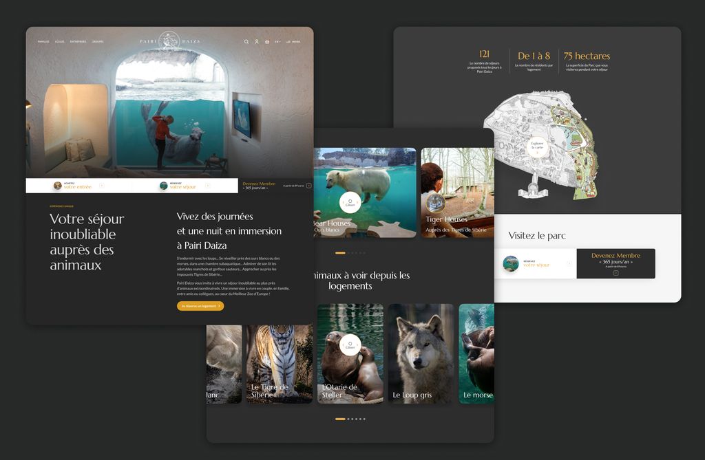
To make the new website fit in a comprehensible commercial and digital strategy, we completely overhauled the content hierarchy, reviewed the users’ paths, redefined the site’s UX and UI, and took over the frontend and backend development. In short, we started from scratch.
Over 200 pages, all modular.
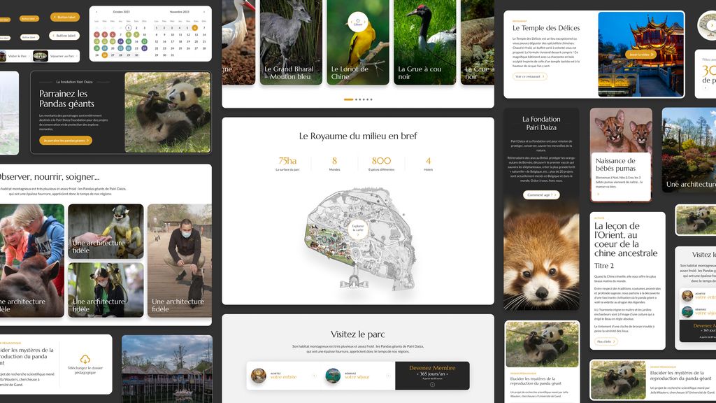
Most of the website pages are built using what’s known as flexible content. With several dozen different components, this approach to page construction gives Pairi Daiza complete autonomy in the creation and modification of their website. They can adapt existing pages or create completely new ones at will.
More than that, we’ve gone the extra mile by creating four variants of each of these components: white, dark, grey, and dark grey. This gives Pairi Daiza the flexibility to choose the background colour for each page, and the style of the components adapts automatically.
Seamless navigation
Technically, the ticketing service and the website are two separate tools. In order to offer the most consistent user experience possible between these 2 tools, we have adapted our code so that several elements can be shared between the two.
The artistic direction, the UX, the header, footer and booking components are shared between the two entities which allows a seamless navigation for all users, minimizing the feeling of leaving one tool for the other.
The trick to making this possible you ask…?
Take a look at our recent article about how we use WordPress in a headless mode .
- Engagement rate 65%65%
- users/days10.00010.000
- published pages+ 200+ 200
