- Year
- 2022
- Client
- Space Applications Services
- Services
- Websites
- Link
- icecubesservice.com
Ice Cubes
Where we're going, there is no gravity
The only little issue… you must own a 70-meters high space rocket to send your team & material in space. Such investment is a bit expensive for most human beings (no kidding!) but Space Applications, a Belgian company which has been involved in some of the most famous space missions, is working hard to change that thanks to ICE Cubes.
ICE Cubes is an end-to-end service that offer fast-track, easy and reliable access to microgravity. How? They developed small containers that can be sent to space (or the ISS) with remotely controlled testing material. No need to rent a full space rocket just for you or to send a full team of astronauts. You can rent just a 12cm3 space and start doing research in microgravity.
Stellar brand experience
Our role? Help them raise awareness about the quality and efficiency of their services and build a digital brand experience that convey strong futuristic vibes.
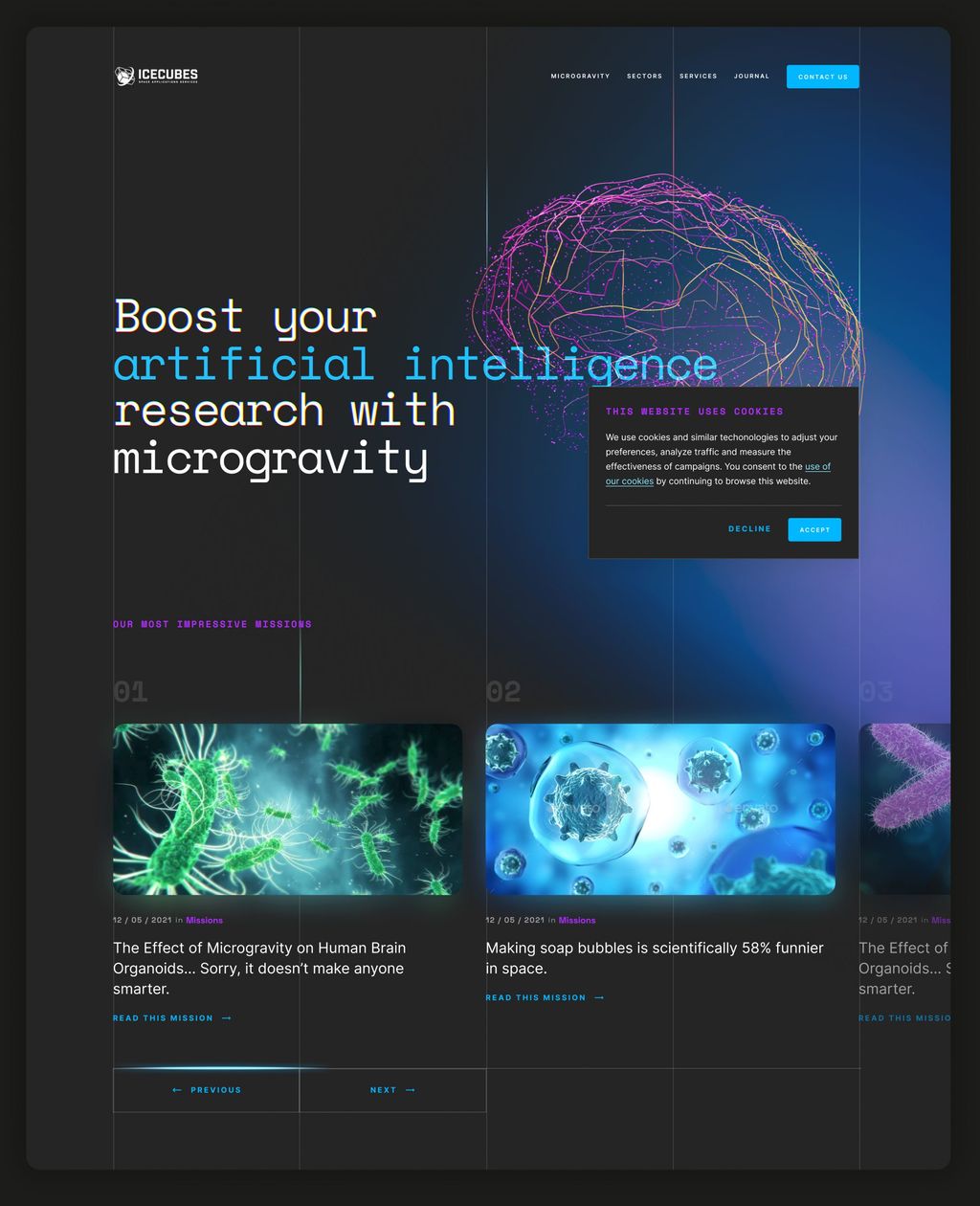
Instead of showing cool space rockets and astronauts floating in the deep vastness of space doing v-sign with ICE Cubes containers, we design the website around the core of the universe: atoms and molecules.
Using a combination of colourful living backgrounds, laser-like interface, truly modern fonts and microscopic images, we wanted to build an atmosphere that gives you the impression of floating inside one of the ICE Cube.
That approach gave us also enough flexibility to differentiate the content categories and topics across the website.
There is a staarmaaaan, waiting in the sky
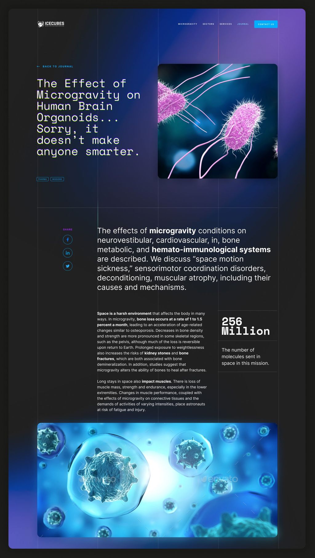
ICE Cubes services is new and quite difficult to understand for most people, especially if they’re not directly working in the space industry. Telling the stories of customers was an essential part of the website as it helps to build credibility and trust while demonstrating experience and expertise.
The whole website has been designed and developed to give maximum autonomy and flexibility to Space Applications staff members so they can quickly and efficiently add new content as they send more cubes in space.
Launching cubes in orbit
So you’re convinced about the added value of microgravity testing for your research? But, still, sending even a just a coin in space looks like incredibly hard and complicated process… what about a 1700cm3 container?
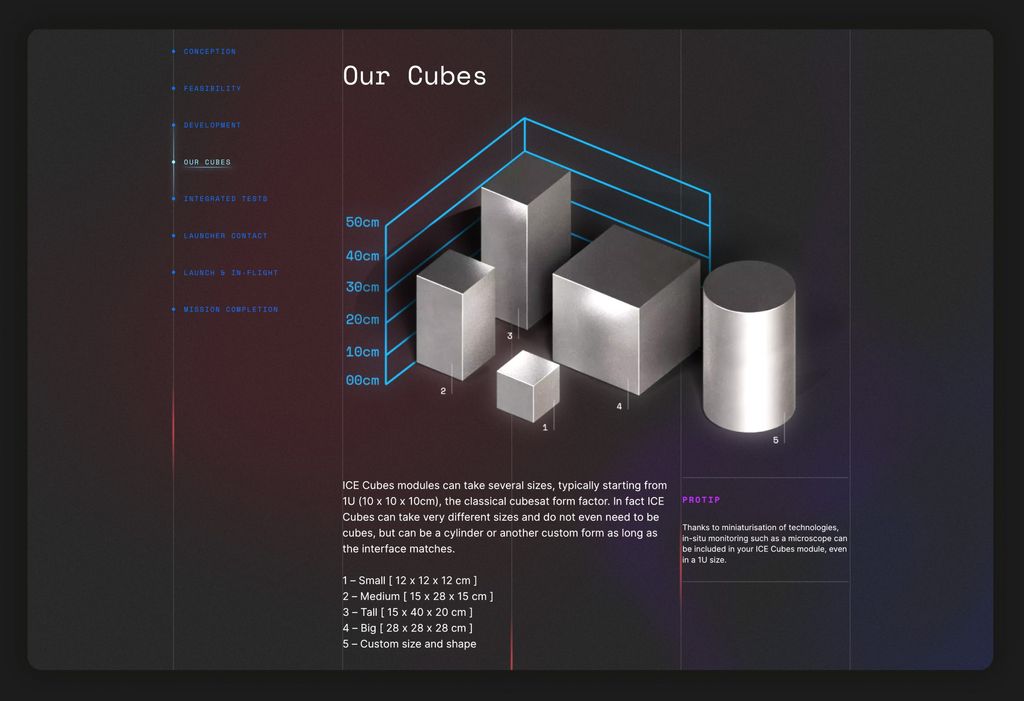
The other focus of the website was to clarify the process, explain the options (cubes of different sizes, remote control,…) using clean design, intuitive navigation and easy-to-understand timelines.
Three, Two, One... Lift Off!
We could not resist…
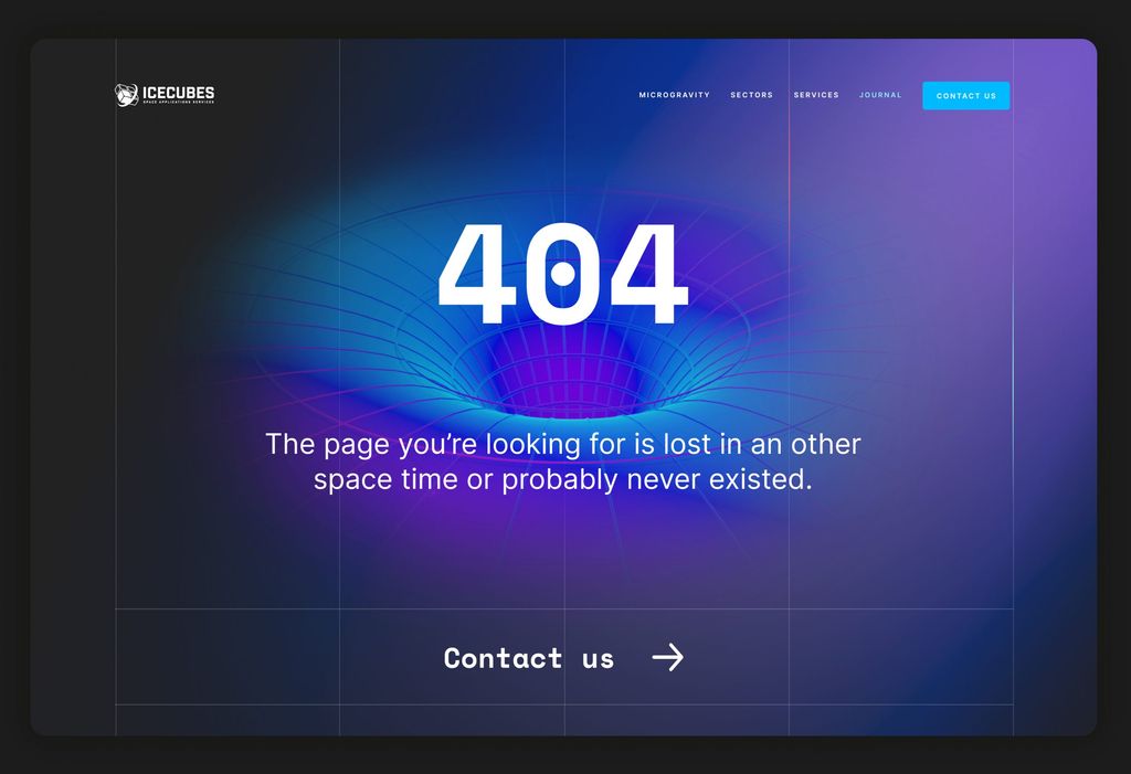
We needed to add a wormhole on the website!
