- Year
- 2023
- Client
- Gimi
- Services
- Branding
- Websites
- Photography
- Link
- gimi.be
Gimi
Brand positioning, branding and website
First there were some early discussions and a couple of workshops with GIMI. We then quickly concluded that, to cut out the competition, we had to clarify their brand positioning and refurbish branding and website.
We guided them on all fronts, from strategy to visuals and technical aspects. And that, my friends, is cool.
Branding
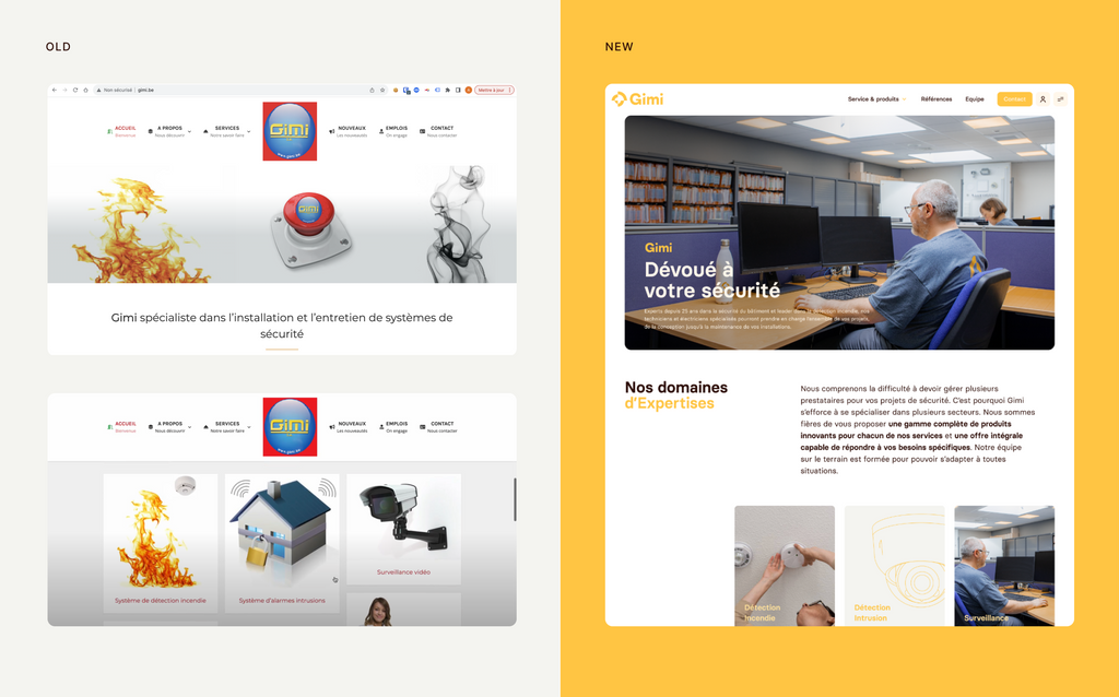
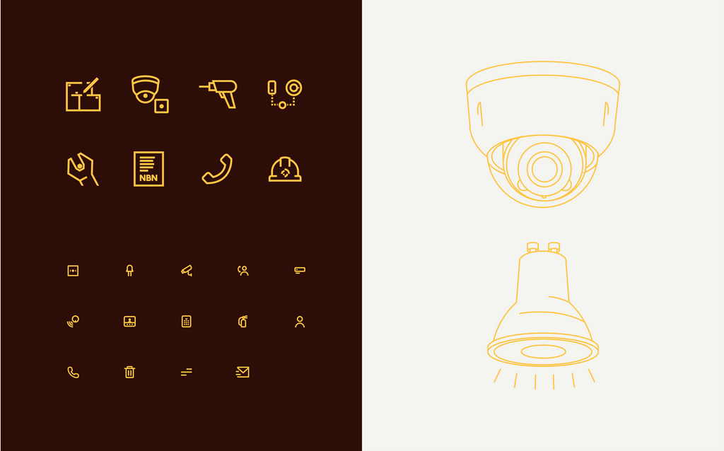
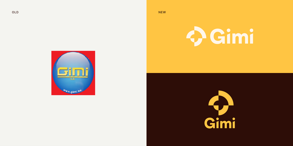
The initial branding was old (as in antiquated) and hadn’t been reconsidered since the company was founded, which was 25 years ago. If GIMI wanted to shine, they had to redo everything: logo, typography, colors, icons… Safe to say we started from scratch!
Some team members weren’t so sure about the branding change at the first design presentation (and a change there was). However, they came around pretty quickly and are now huge fans… some even wear their GIMI T-shirts on a daily basis!
Picture day
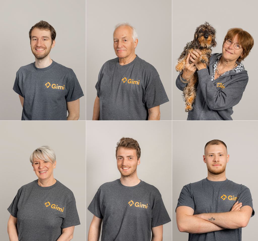
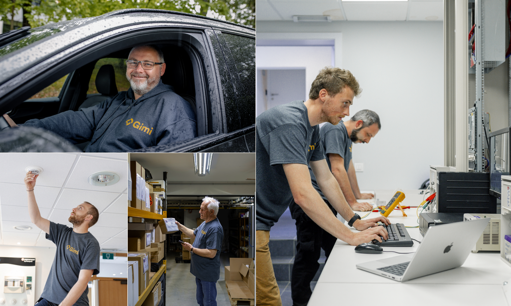
What is one thing every website needs? That’s right, visuals! In keeping with their positioning, GIMI wanted to emphasize the people aspect of their business.
Without further ado, Long (our talented designer and photographer) was at GIMI’s for two days of intense photo shoots: office shots, portraits, daily occurrences, candid shots… and even dogs!
Website
New positioning, new branding… and the website? That one had to be equally as old… as in 25 years, give or take!
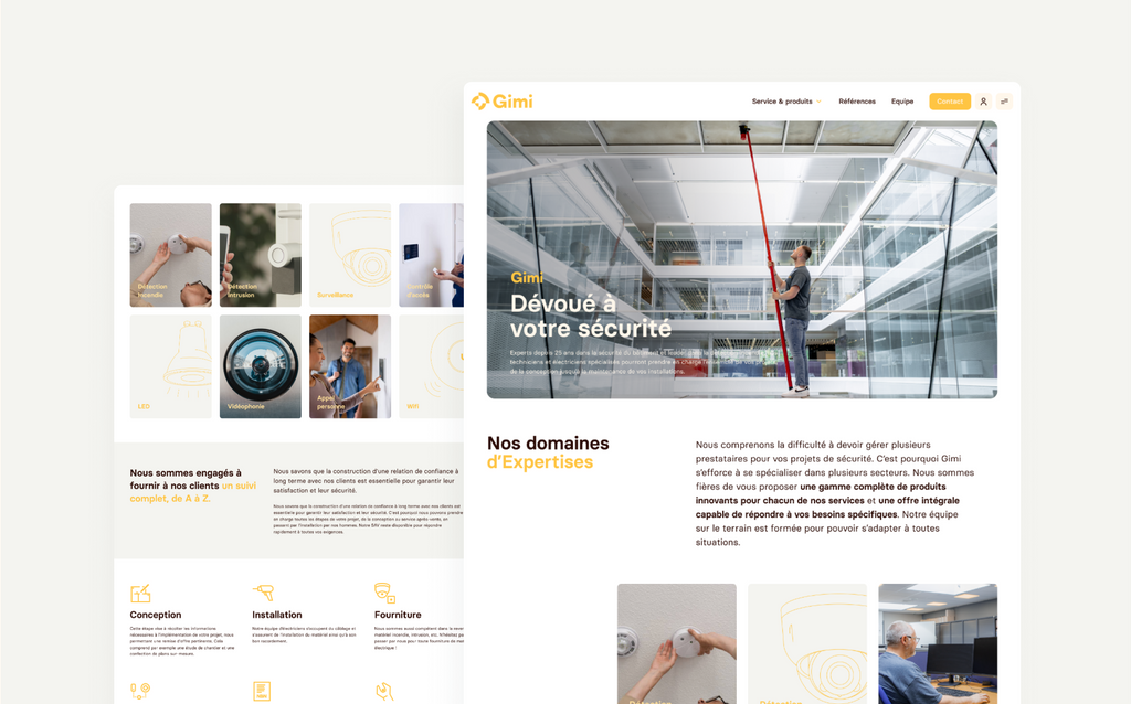
The entire project team worked creatively and efficiently to design a website that was engaging, effective and scalable. We wanted GIMI to showcase its expertise, projects, career opportunities and other content with complete autonomy.
To achieve this, we designed and developed a library of visual components. This allows GIMI to easily create pages and modify their layout, while maintaining visual consistency.
Now for the cherry on the cake. To achieve that top-notch result, we worked on a series of animations: logo, buttons, page transitions and so on. That’ll get you going, won’t it?
