- Year
- 2018 - Ongoing
- Client
- Elantis
- Services
- Branding
- Websites
- Apps
- Link
- elantis.be
Elantis
Combine and improve
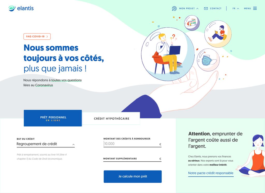
Initially, Elantis’ digital presence consisted of 2 different websites : one for mortgage credit and the other for personal loans. It turned out to be very confusing for all their clients and pretty heavy to maintain.
In collaboration with their marketing department, we brought these 2 services together into a single website, thus improving the user experience and strengthening their brand image.
In parallel, a custom in-depth data analytics system was put in place to track conversions and support the marketing and commercial department in their daily business decisions.
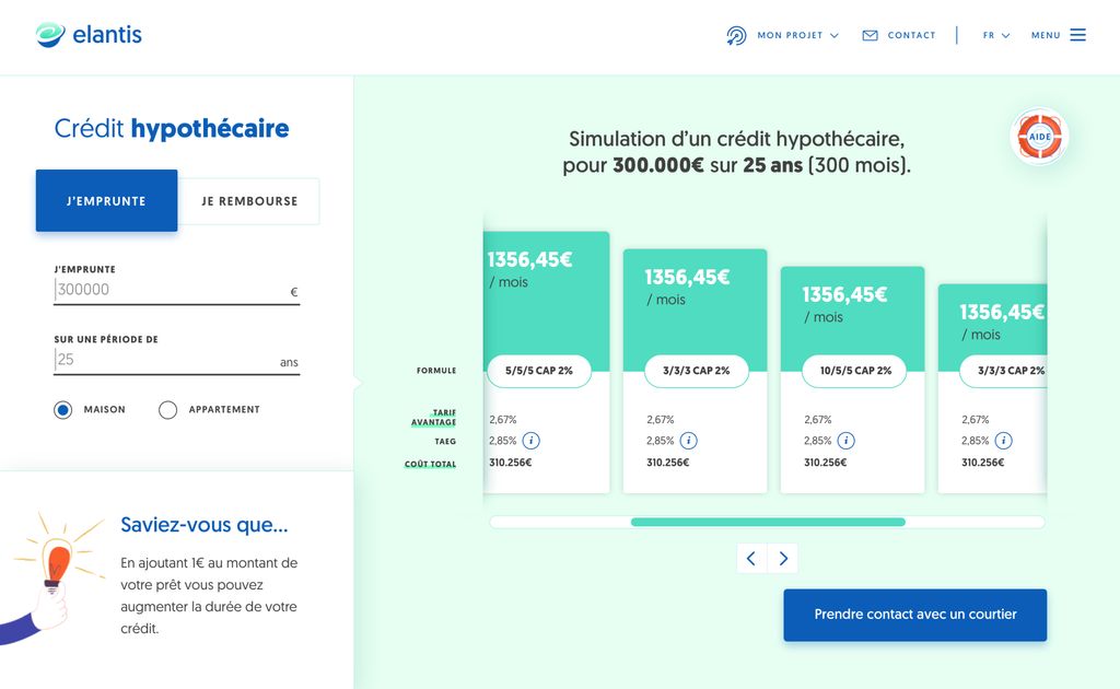
Loan applications made easy!
Friction can be very high when applying for a loan online; it’s all about boring forms to fill in with a whole lot of questions, legal constraints and documents to upload.
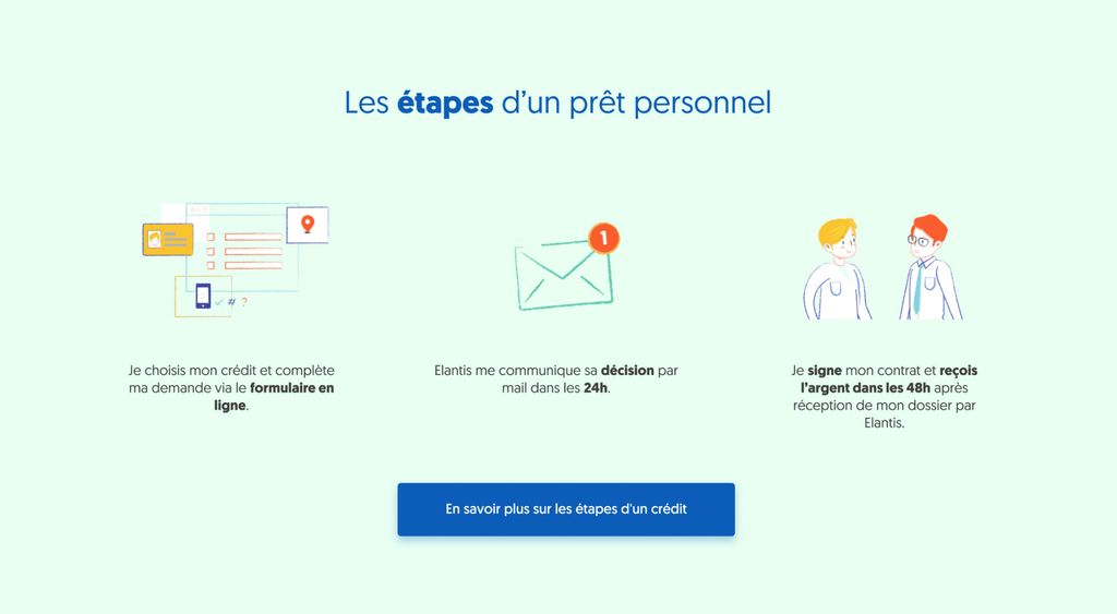
Extra care was put into the loan simulator and the dynamic credit application form in order to offer all users a simple and understandable experience.
A distinctive brand image
We knew upfront we could not touch a single pixel of Elantis’ logo. So a complete branding overhaul was out of the question.
But we wanted to stay veeeeery far away from stereotypical image banks’ pictures showing a firm handshake, a green piggy bank, or a smiling woman jumping in the air and holding cash in her hands…
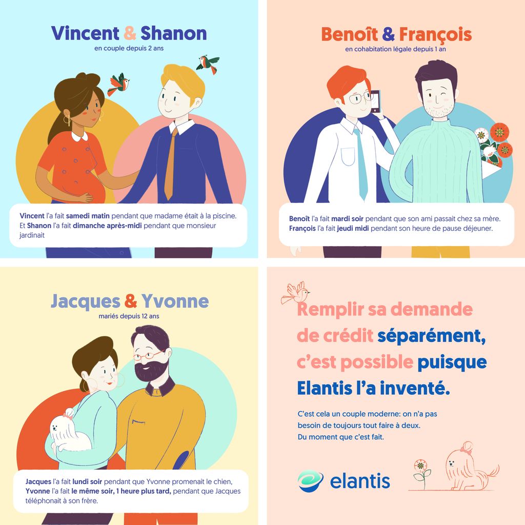
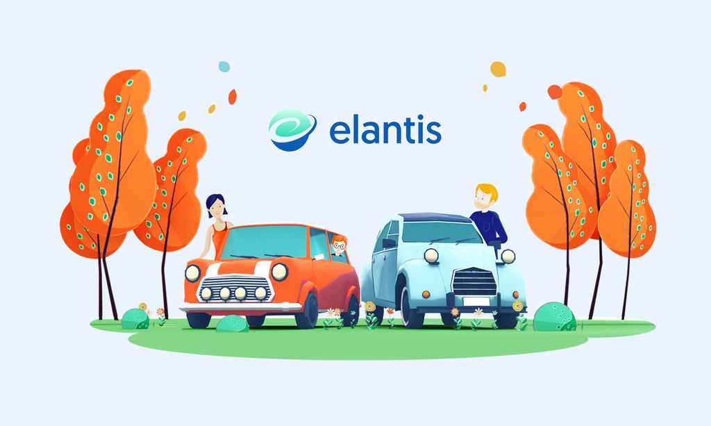
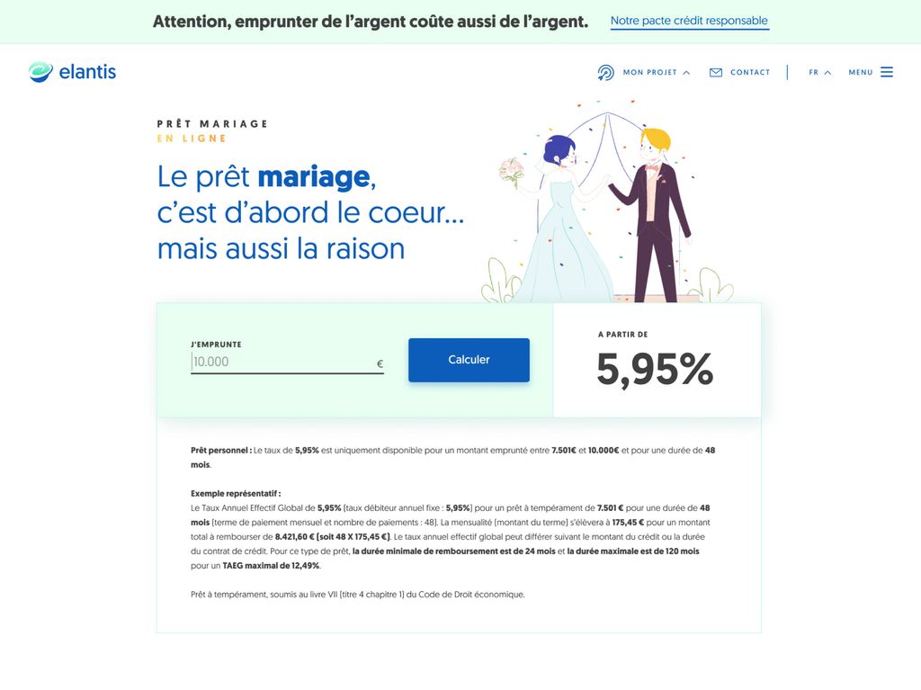
As loans are not the easiest thing to depict, we decided to go for an illustration-based brand image. We created light and feel-good characters to illustrate what Elantis’ clients could achieve with a loan from Elantis.
It keeps evolving over the years (2D –> 3D) and each campaign is now clearly recognized as “Elantis branded” thanks to their very specific brand image.
